First year working at Bankin’ as a Product Designer.
I was the only Product Designer at Bankin’, so all the projects and artboards shown below are my designs. However, the product team was also composed of one Product Manager and one Head of Product with which I worked closely during the various tasks that made up those projects. The Bankin’ app has more than 6 million downloads and is, at the time of writing, the #1 grossing finance app in France (Play Store). So it’s safe to say that all the designs shown on this page have been, or will be, seen by hundred of thousands of people.
All my designs are made for small phones first, which is what our user base uses the most. I’m sorry, no fancy iPhone 13 Pro Max designs here.
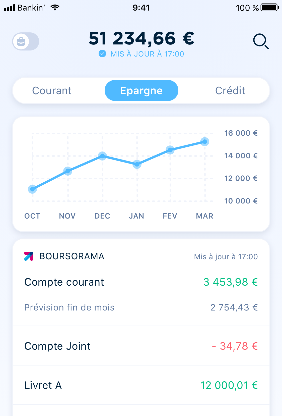
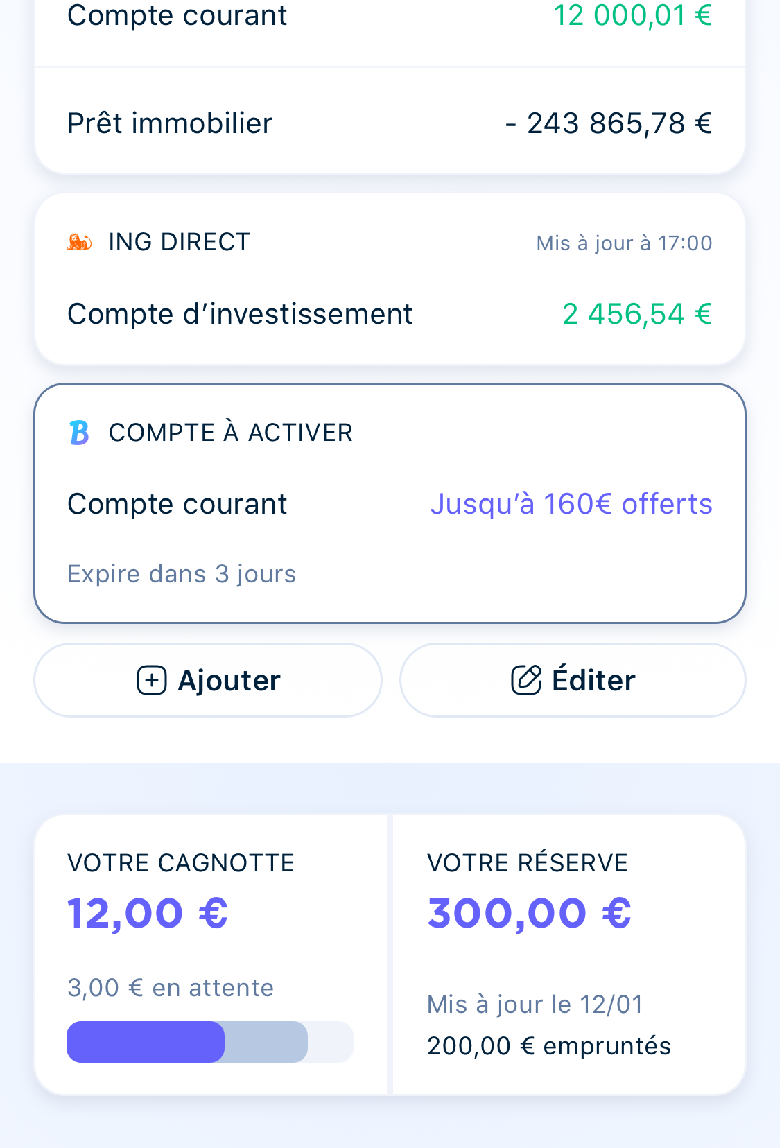
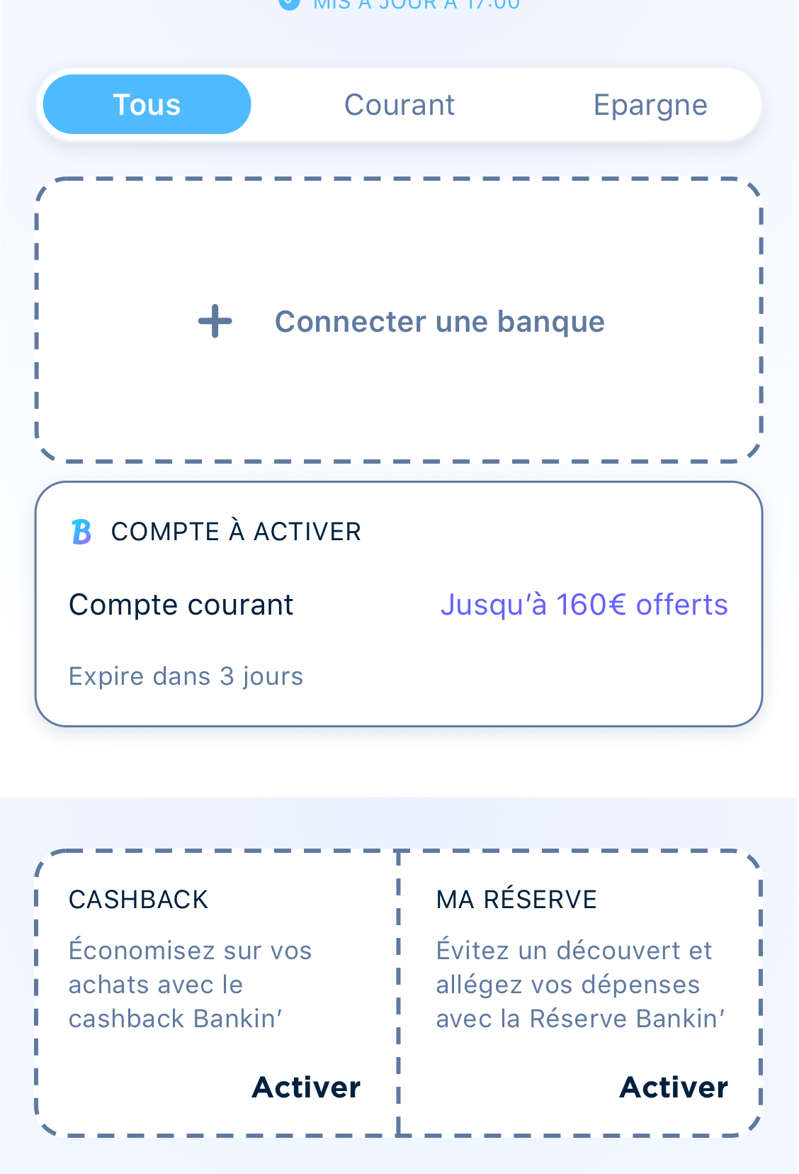
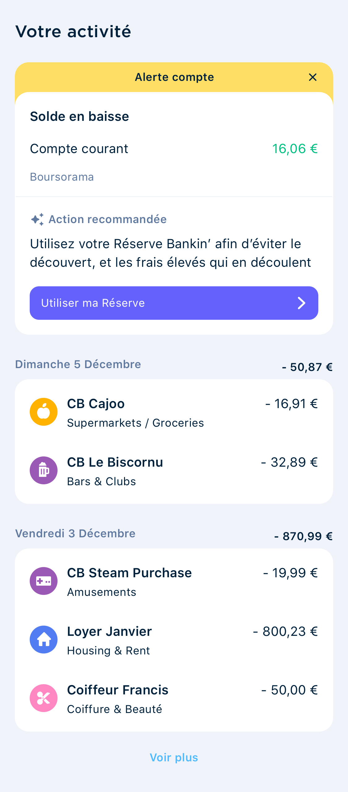
New Homepage
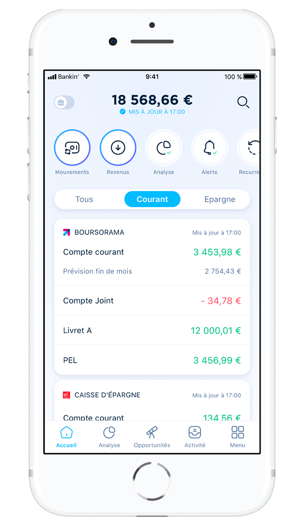
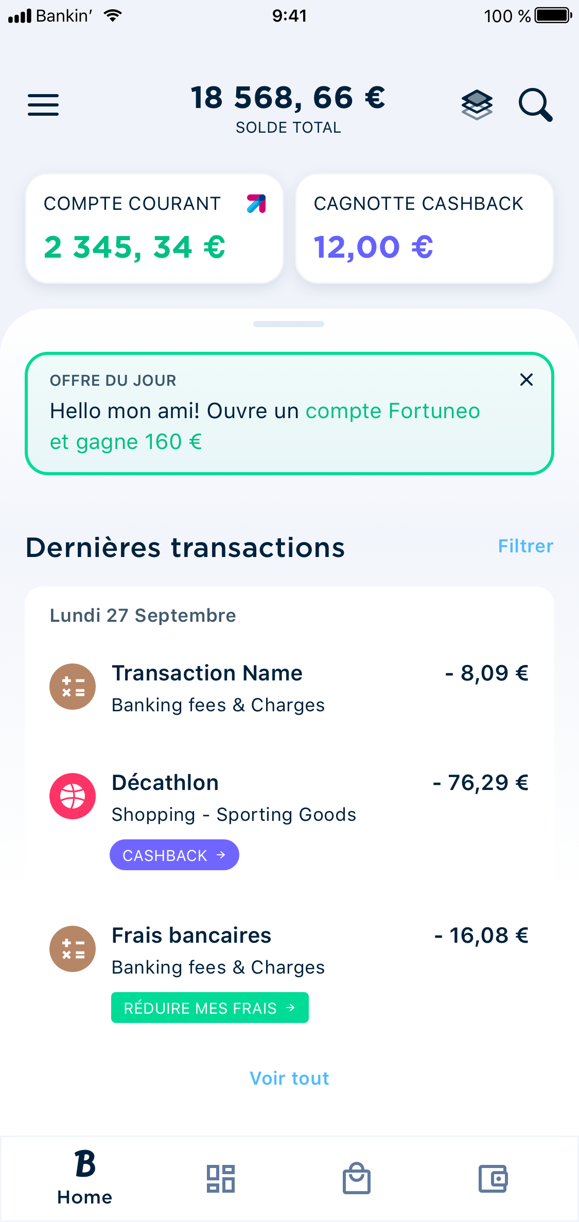
The homepage of Bankin’ was getting pretty old when I arrived in 2021. The design followed the trends set by Google in 2014 and onwards, but it stayed pretty much the same since then. Also, it didn’t follow the app’s value proposition anymore, since Bankin went from a simple account aggregation app, to a much more complex budget companion app. Here are a few screens of the old version.
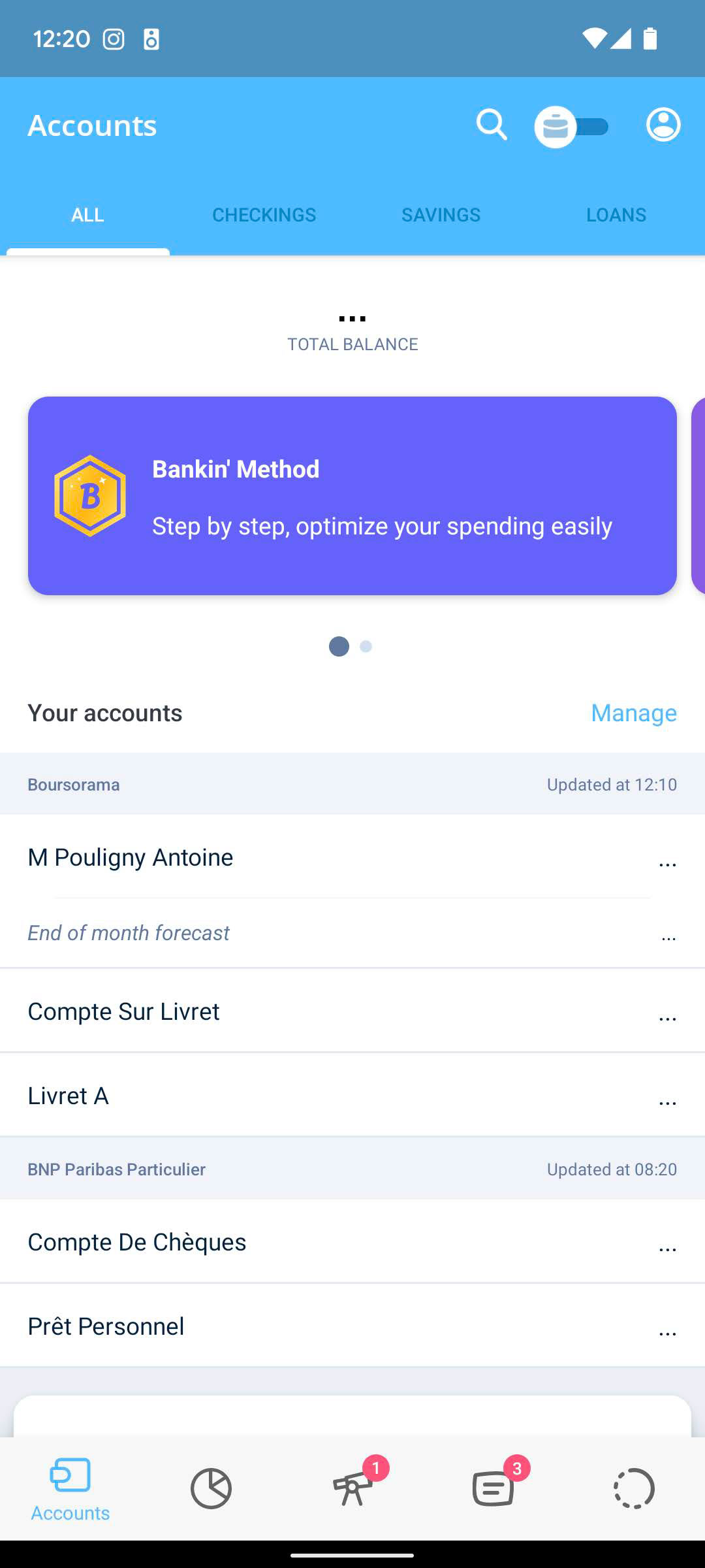
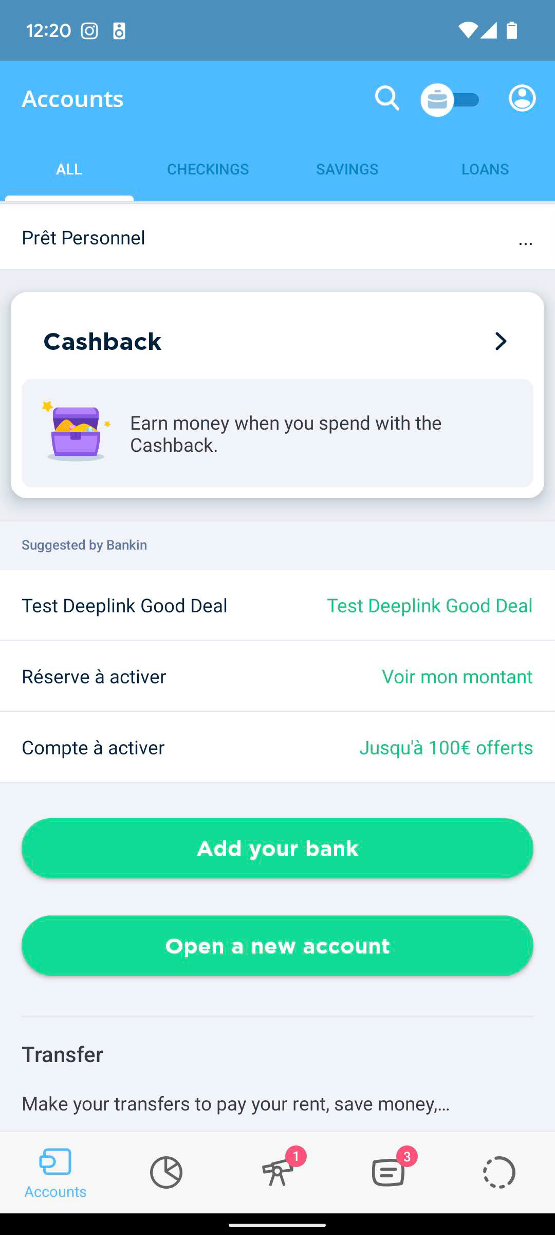
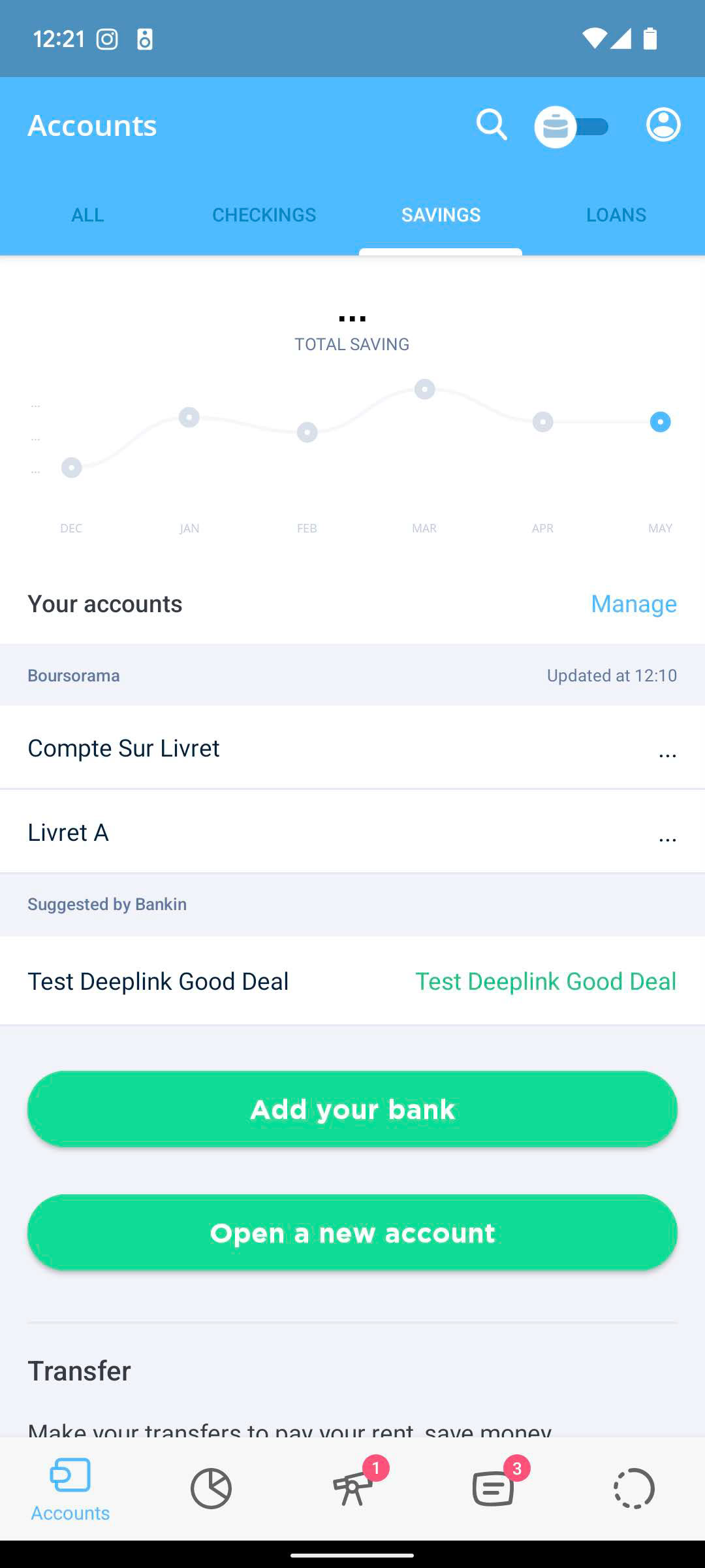
Over the course of several months, we worked back and forth between the product, marketing, tech and operations teams to reach our goal. This led to many iterations that we were able to test along the way, which resulted in the released version below.
And here are some details from there and there. Tap on an image to zoom.
All these designs were thoroughly tested, with tens of user interviews and surveys. Having limited developer force to test it live, we tried to do the most during the design phase.
Also, in an effort to modernize the UI, I introduced a new open source library. During this project, I worked on adding extra icons matching the style of the library.
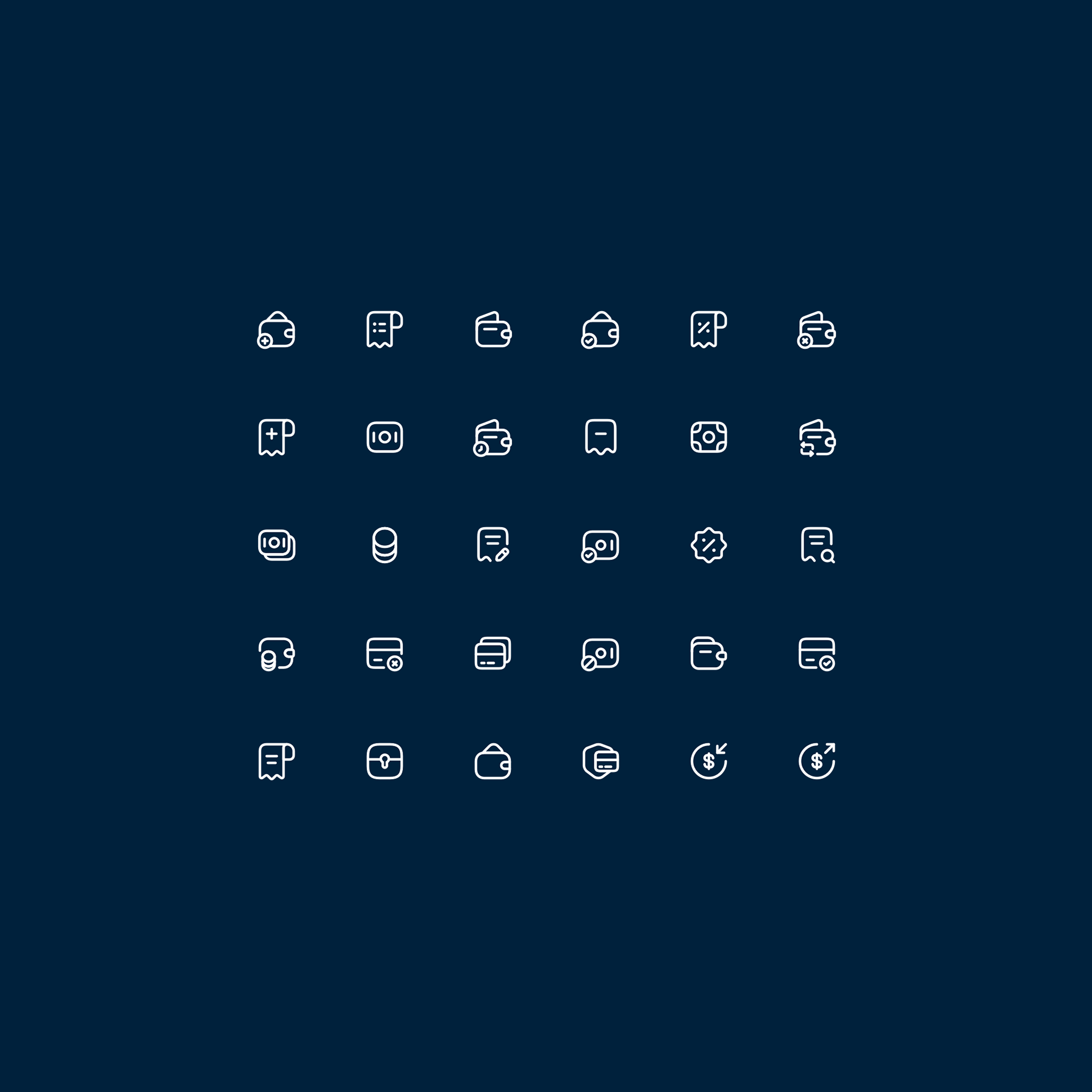
I’ll now walk you through some of the iterations and ideas behind this final design.
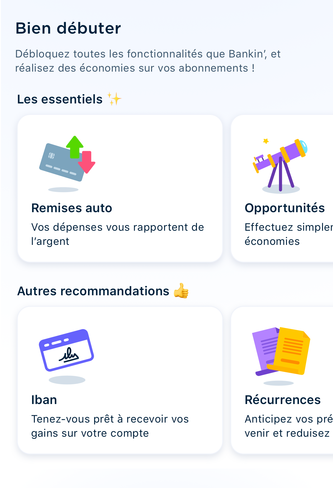
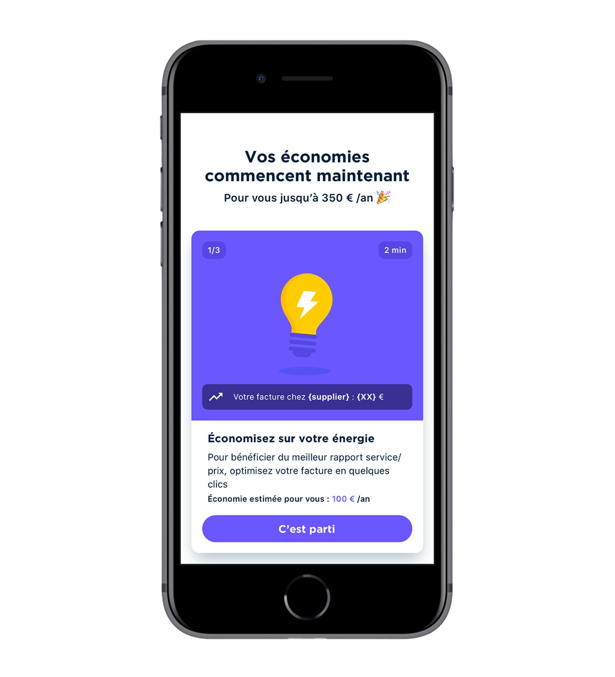
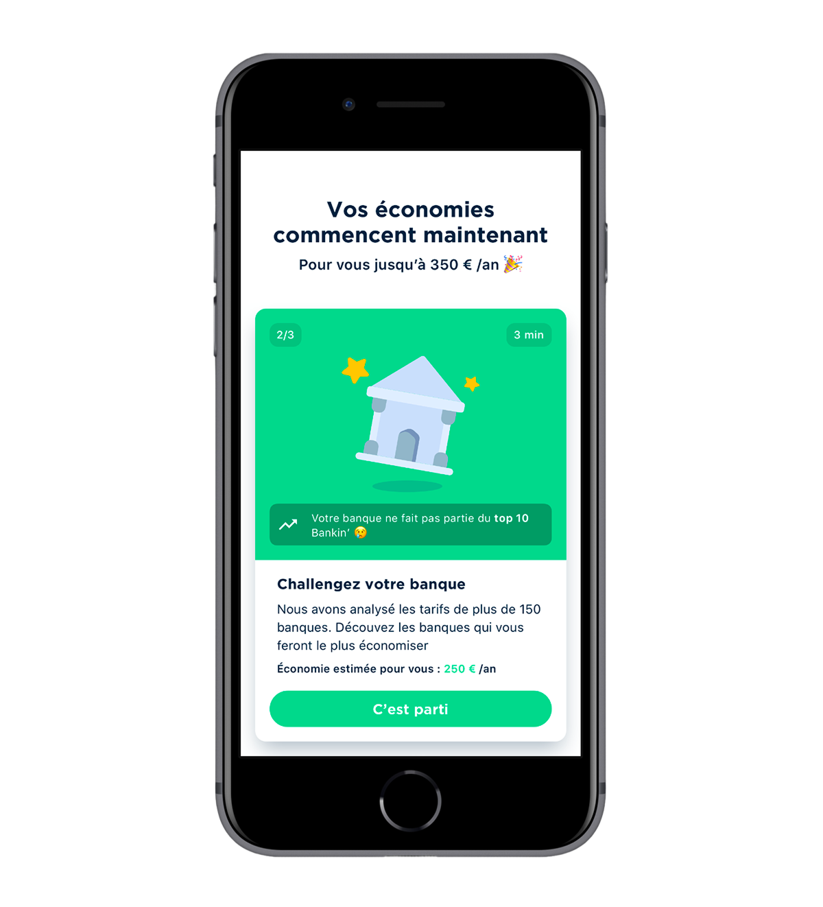
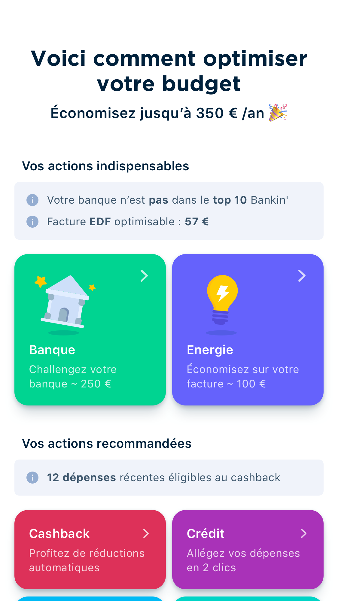
The two main goals for this project were first, to have a landing page that represents the app’s value proposition, and second, modernize the UI. Bankin has evolved a great deal since the old design was implemented 5 years ago. Account aggregation itself doesn’t bring back money so the company needed to diversify.
The first thing we did was to add what we call “Opportunities” to the app : switch banks, internet provider or electrical company for example through the app and save money every month. The second was to add automated reward systems, like the Cashback, that rewards you a percentage of your purchase. And the last (for the moment) is the possibility to contract micro-credits directly in-app, when needed.
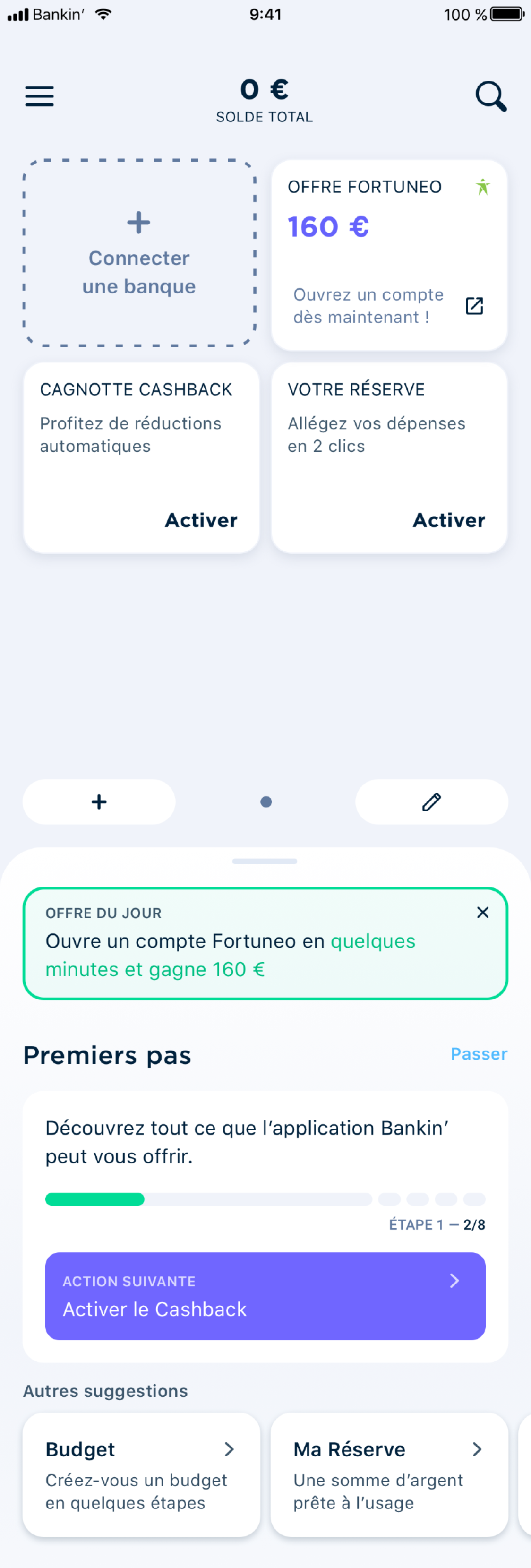
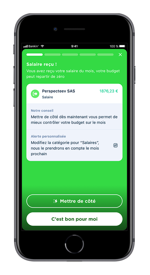
Some of my early designs were doing just that. By having a collapsible shelf containing the user accounts, we could bring more attention to the rest of the app. And the “Last transactions” block right bellow was to push our solutions to the user through his own transactions.
By putting user accounts, and Bankin’ accounts (Cashback and loans) together, we would’ve blurred the line between them.
However, such designs had a few issues. The first being technical complexity; Bankin’ had a real shortage of developers at the time, which prevented us from implementing drastic changes to the current layout of the homepage. The second reason was that the board wasn’t very comfortable with too much change to the accounts section, since most of our stock users use it every day.
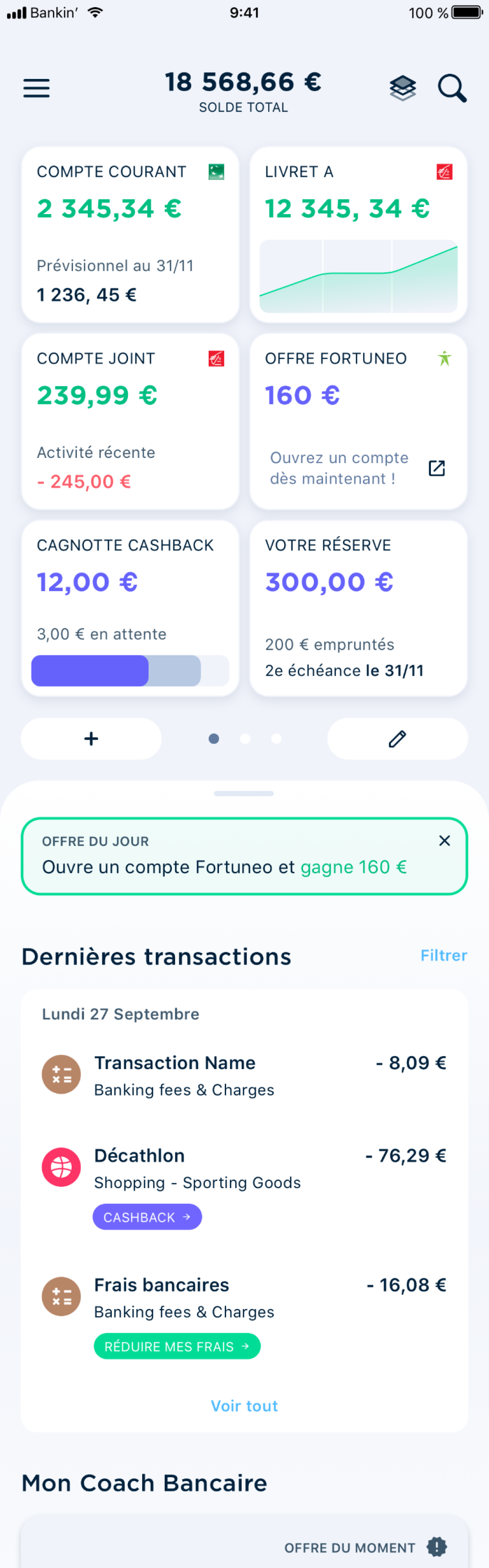
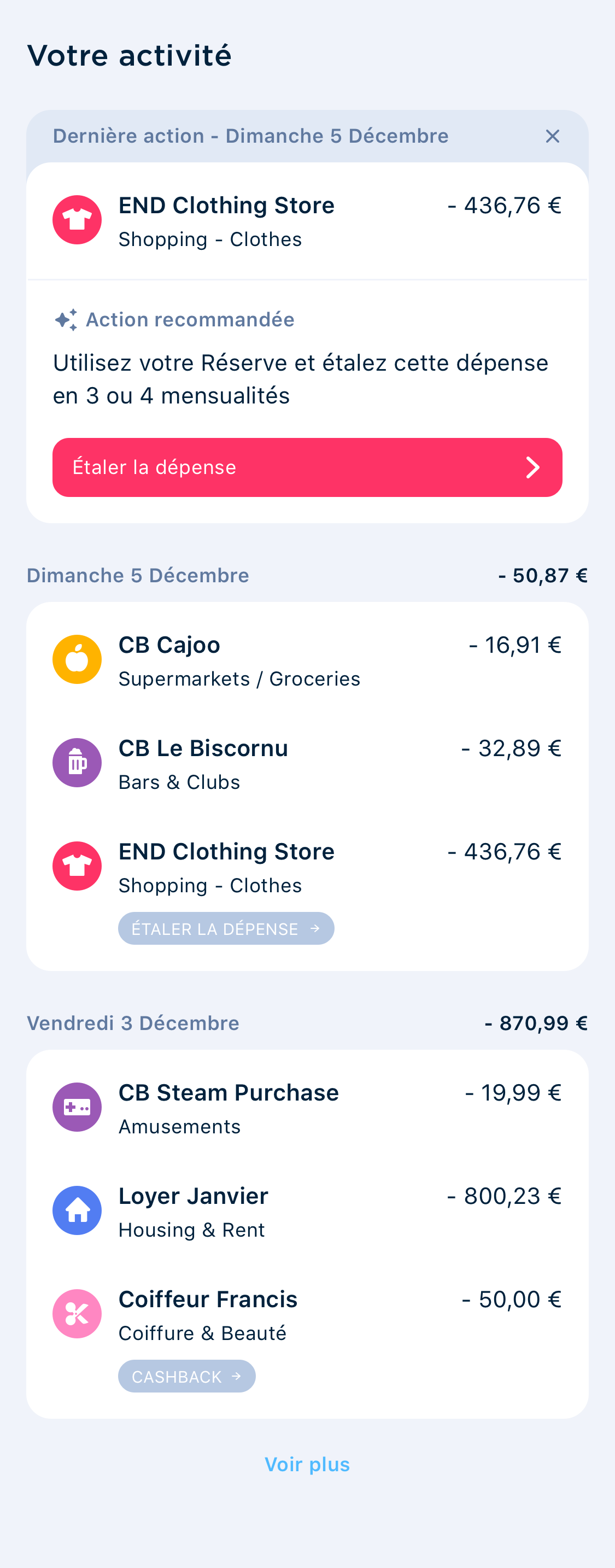
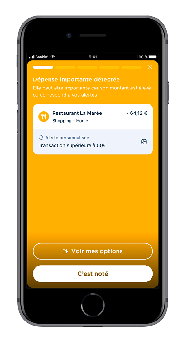
After lots of iterations and testing, we came back to a more traditional list and card design that you saw earlier, and removed completely the “last transactions” block. Instead, we are working on a Story system, that highlight precisely a few of the user’s transactions, and pushes them to take action when needed.
What’s next?
The version currently implemented is still far from what I’ve designed with the product team. A lot of features and blocks are still missing, to complete the experience and make it truly in agreement with our vision. The navigation is currently being revamped too, to continue to make the app better suited to the company value proposition.
But I’d say it’s still better than what it was, and the data we collected so far agrees with this statement. People like the new homepage, and even with the minor UX changes we made we’re already seeing more conversion in our products.
Onboarding
Reworking the app onboarding was my first project when I arrived at Bankin’. The old onboarding was very complex and time consuming (5-10 minutes), and years of AB-Testing made it very unstable.
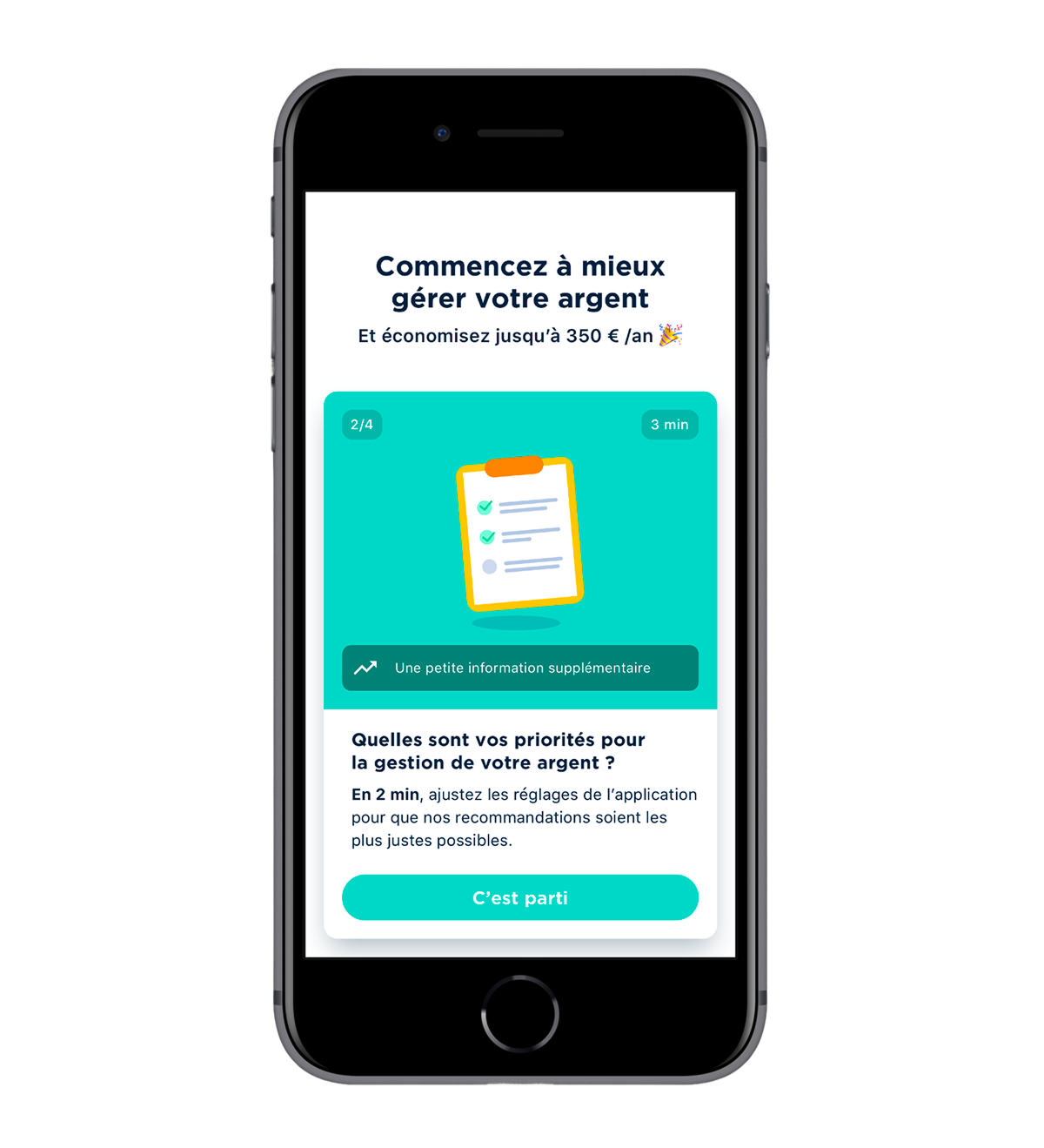
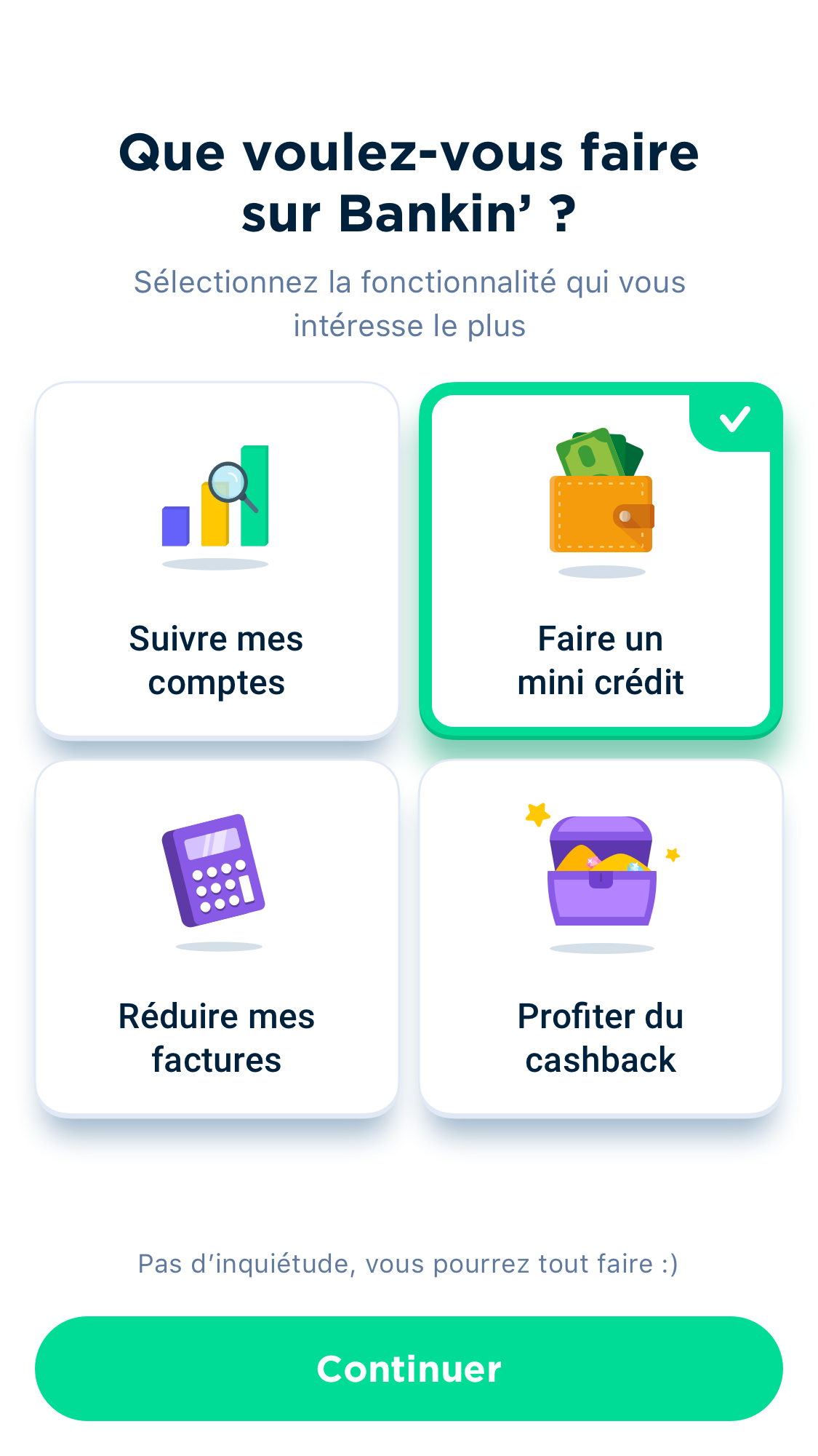
With the new onboarding, the set objective was trifold : present better what was the application value proposition, make the user opt-in on more features earlier, and make the whole process faster and less painful.
I did dozens of iterations for this project, along with Principle prototypes that we used both during Guerilla Testing sessions at Gare de l’Est, and during user interviews, as we wanted to get it as right as possible for the user.
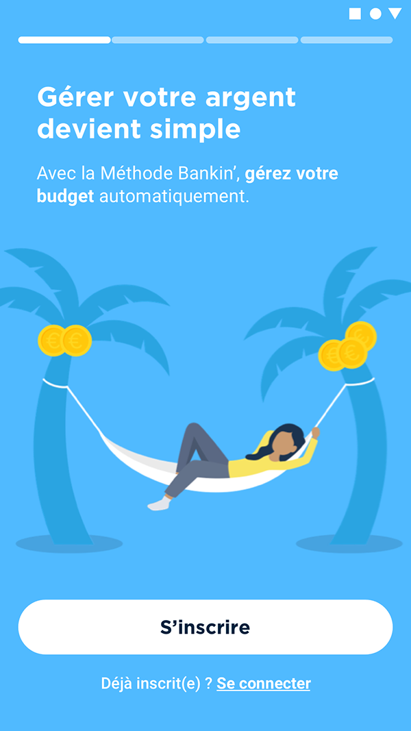
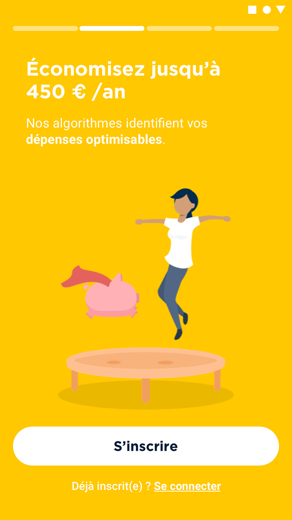
The result was in two distinctive parts. First, as you can see below, the “stories” replace the old login screen that just had text fields to create an account. Its goal is simply to give the user insight about what to expect in the app before creating as account. All illustrations are animated.
Then, after creating his account and adding their first bank (we’re an account aggregator after all), the user is shown various cards one by one, each starting a small series of screens. Some are skippable.
To further capture interest, each card shows a personalized element that we get from his bank connection : his electricity bill, bank charges, his last transactions, etc.
All these designs were thoroughly tested before being released, and the end result proved all our work : more than 75% of users complete the onboarding now, which increased dramatically our revenue per new user. It was a resounding success.
Below are other final choices that we tested for the onboarding, that gave the user more leverage on what to do, but unfortunately (and logically) it reduced our revenues.
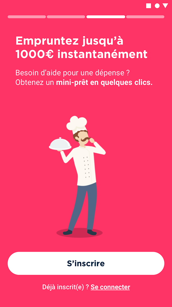
Loans
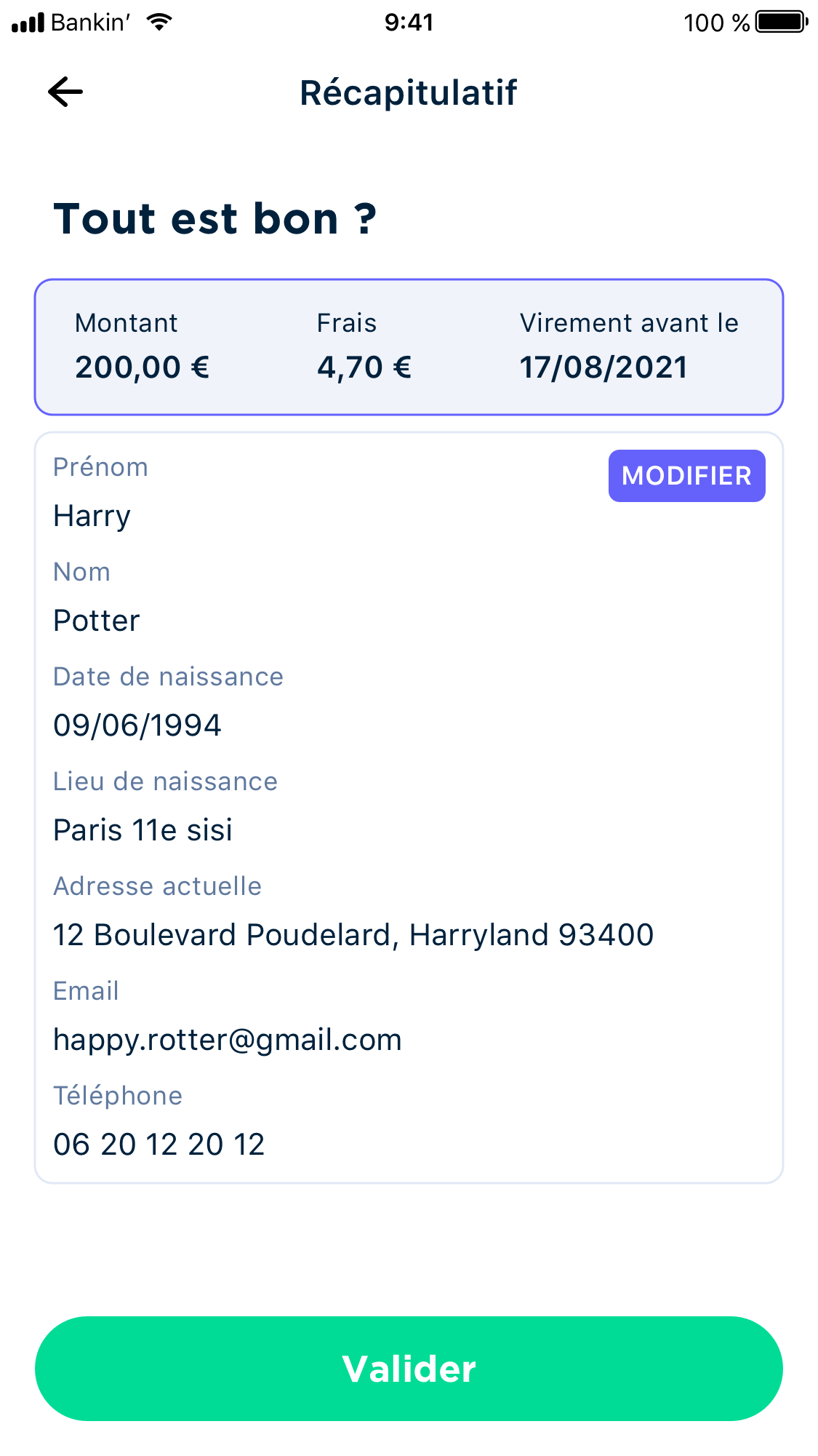
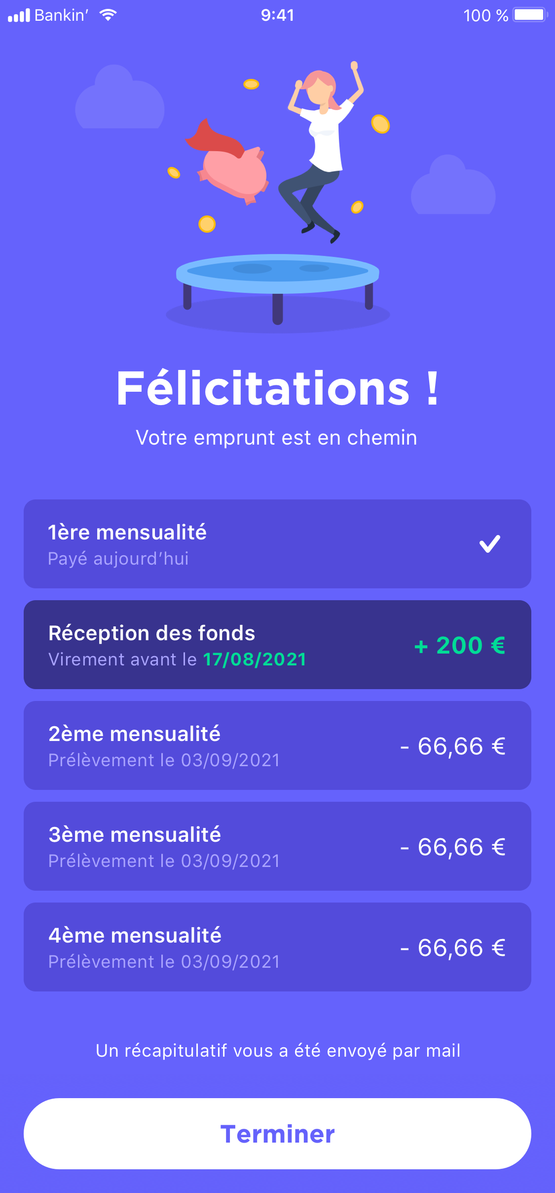
Another project I did from start to finish was the “mini-loans” we offer in our app. Such loans require, like all loans, an identity verification along with some kind of repayment capacity analysis.
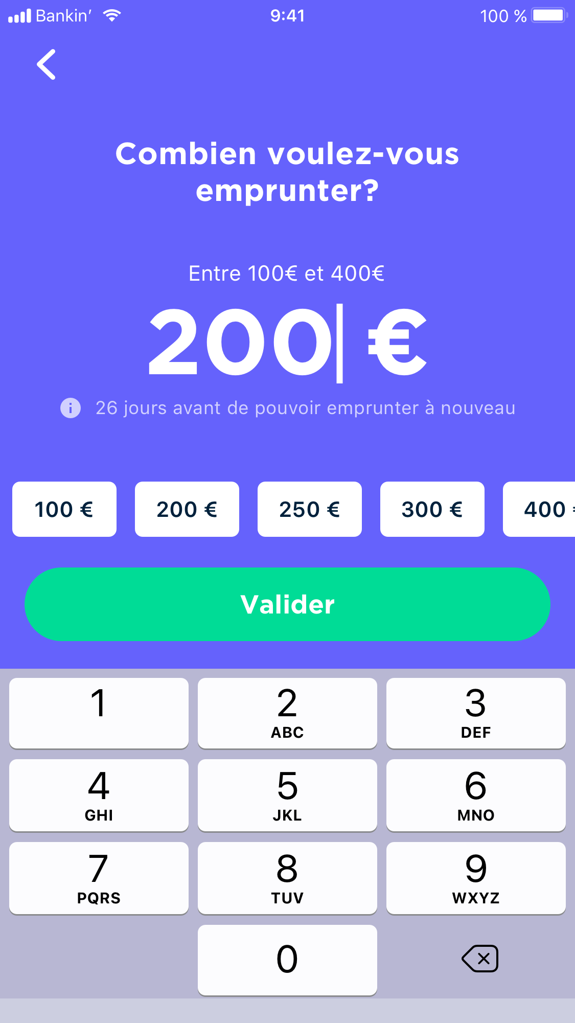
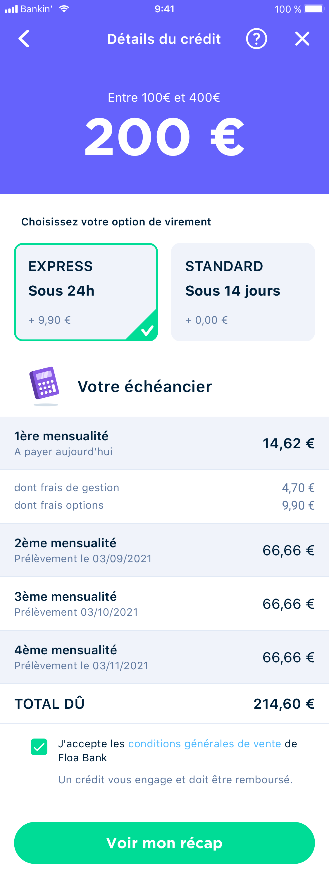
I was tasked with the creation of a native series of screens for the user to input his information, and then some screens for the loan itself (timeline, options, etc).
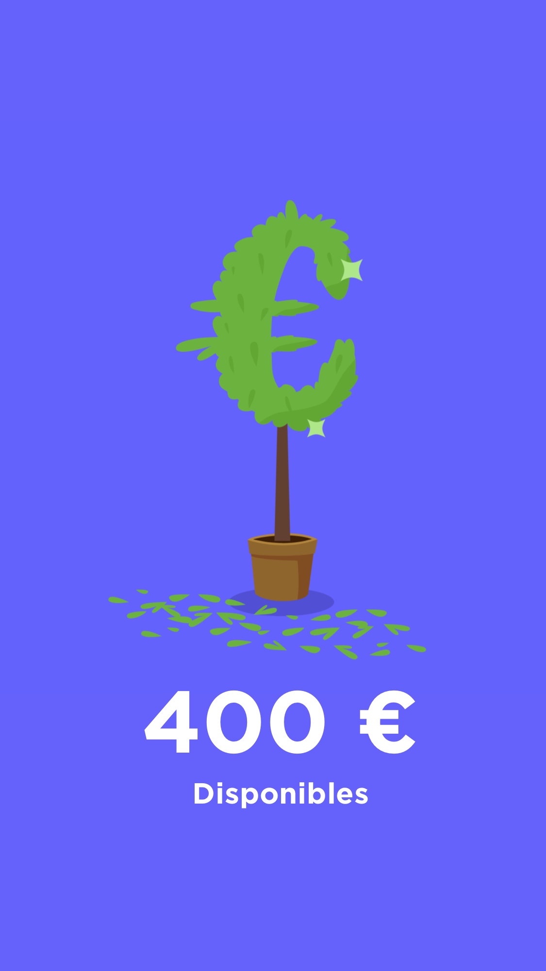
This is pretty much straightforward. I separated each type of information by type, so the user stay focused and has no issues navigating the page. Once this is done, an animated loader plays, and the next page displays what amount of money he’s able to borrow.
Next comes the less fun part of the process. You choose what amount you want and review the repayment timeline, the delivery option, and such.
Lastly, a series of screens are here for verification and confirmation purpose.
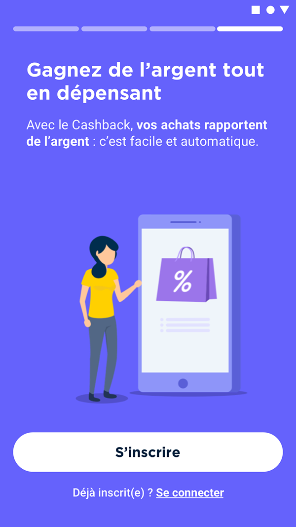
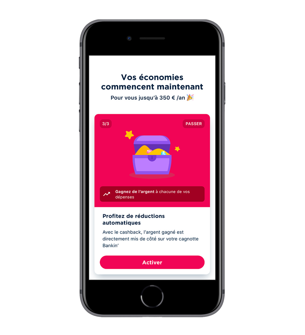
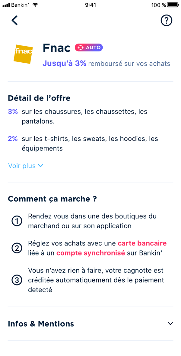
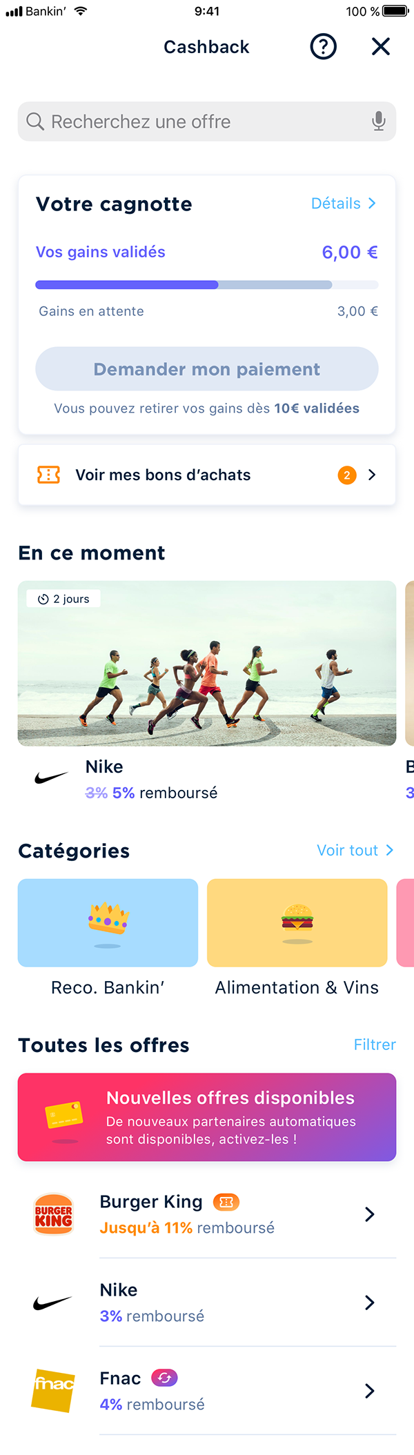
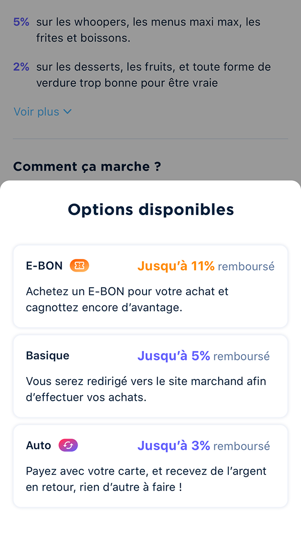
Cashback
Cashback is a kind of reward system, that gives you back a percentage of the purchases you make.
It can be automatic, or through a voucher, or finally through a referral link. All three of these systems are or will be in place in the Bankin’ app. At the time of writing, the vouchers are yet to be implemented.
The base for the designs shown below was made by Romain, the previous designer, but I added and changed a lot of things during my work for our projects.

When we added the automatic cashback, I had to come up with a solution, in order to make both this type and the referral link type of cashback coexist together. Using a simple symbol and a gradient, that we don’t use elsewhere in the app, I made something easily recognisable by the user.
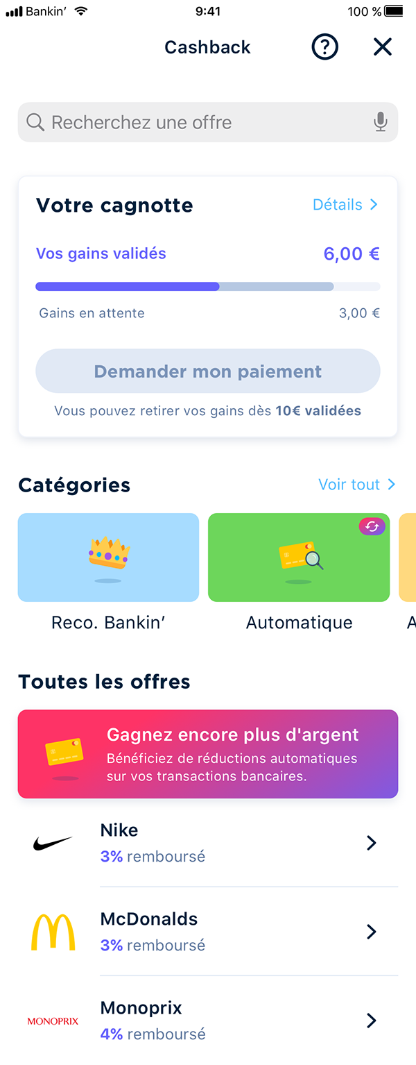
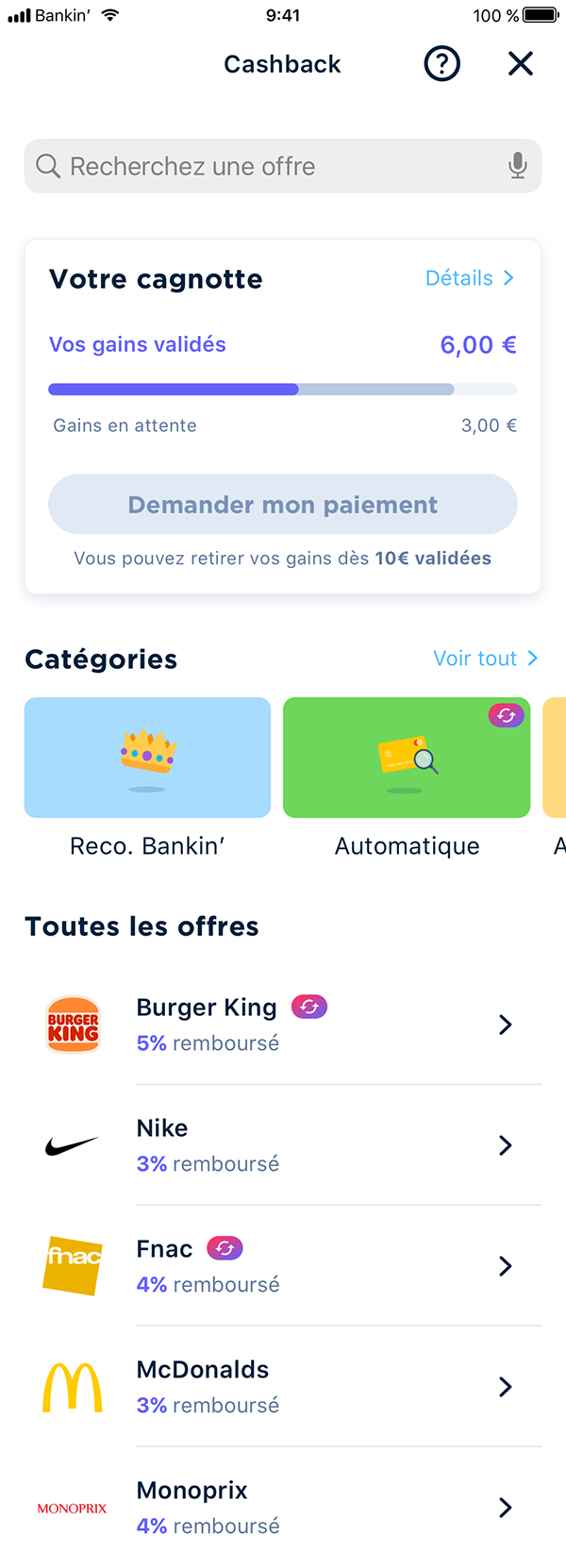
Similarly, for the vouchers that have yet to be implemented, I designed another icon and color code to make it stand out.


This project was still a great challenge, since the Cashback is not so accessible to anyone, which can result in low interactions. For the various offers to coexist together I participated in many workshops, taking into account all user backgrounds to better frame our customers’ interests. This approach yielded great results, as per our metrics more than 40% of our new users activate the cashback in their first week.
What about the design system?
Oh yes, I’m getting there. With a new design comes a new —or at least updated— design system for the app. For years now, Bankin’ has been a single-designer-company, and as you should know, doing a design system correctly can be pretty time consuming, to say the least. That is why, the design system we had at Bankin’ when I arrived was kind of… limited.
I can’t pretend I did a perfect job, my time for such projects as a single designer being as it is, but I tried to make the most of what we had and complete it, to have something practical.
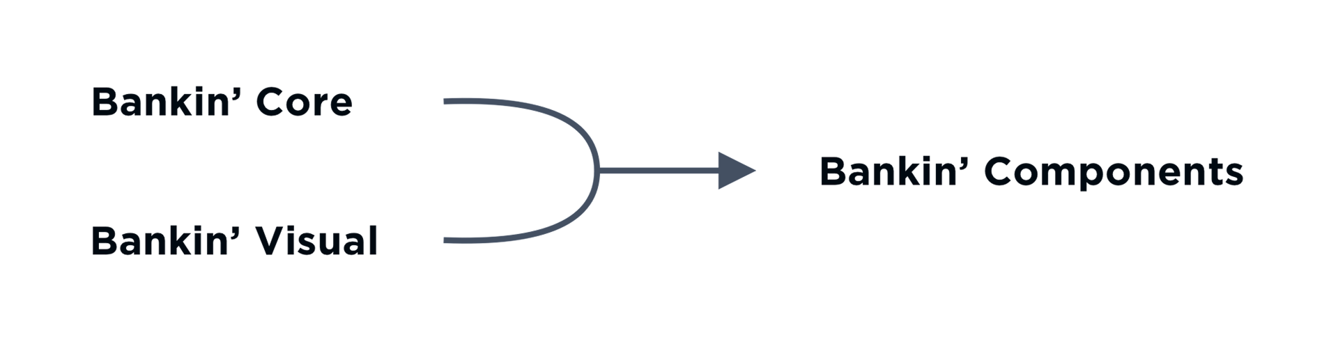
This is how the Bankin’ Design System is organised. The Core file contains all colors, text styles, and layer styles, like shadows and such. The Visual file contains all illustrations, icons and images used through the app.
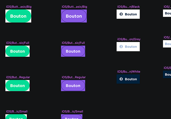
Finally, using elements present in the two first files, the Components file contains buttons, menus, navigation bars, headers & footers, cards, etc. that are then used in the screen designs themselves.
Yes, this is on Sketch. I did the whole migration to Figma the following year.
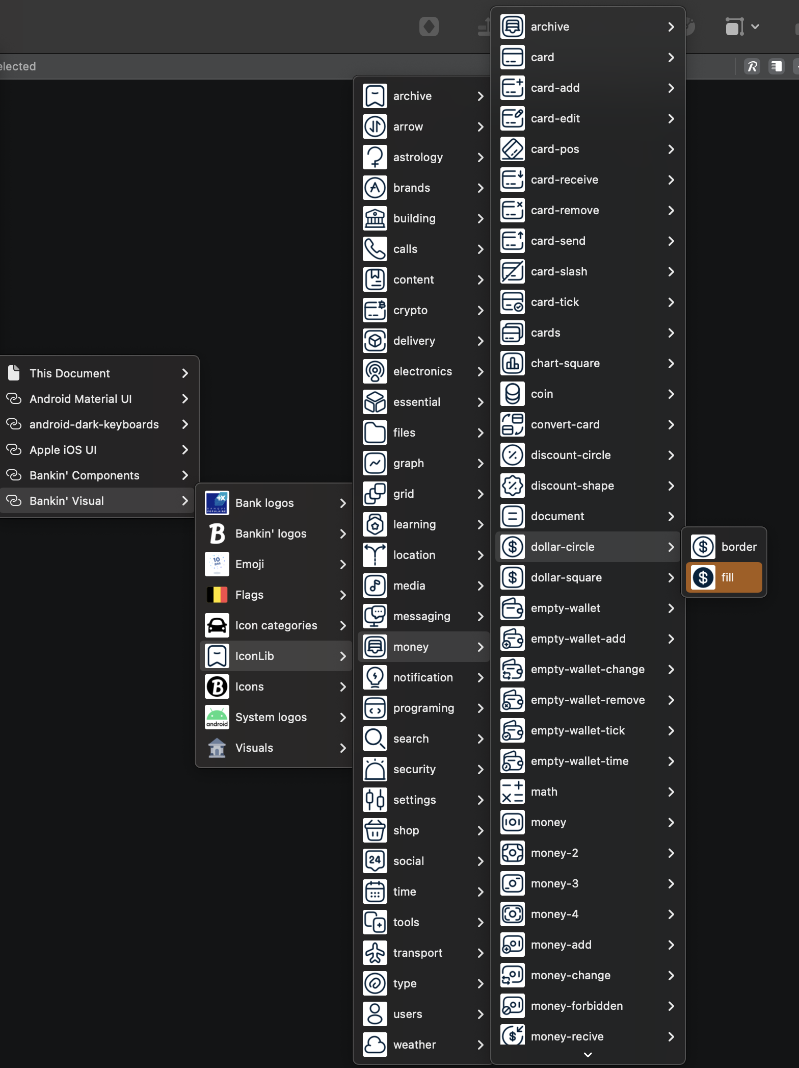
Took me hours to organize all icons into usable categories
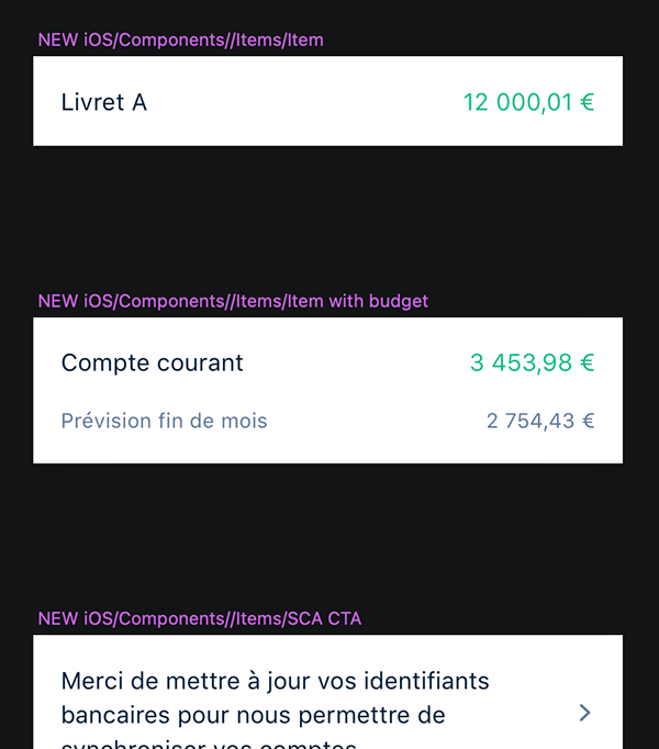
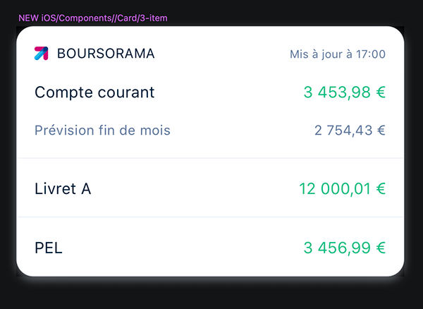
In the Components file, elements are separated further into encapsulated categories, from simple to complex :
- Miscellaneous (text fields, buttons, toolbars…)
- Items (account line, error lines, transactions…)
- Cards (card like elements that contains multiple items)
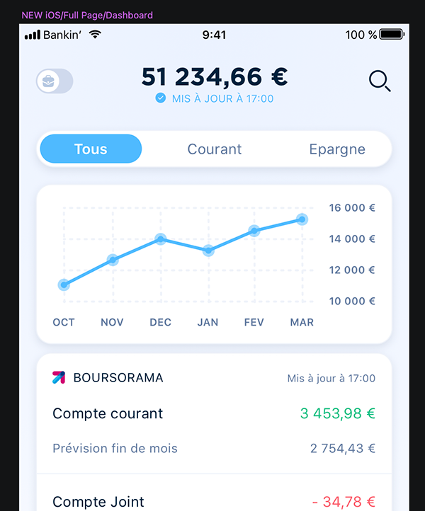
- Pages (contains multiple cards, and navigation)
If you add the Core file and Visual file, that makes a lot of categories! But the main advantage in using such a fine design system, is that the overrides possibilities are far greater when placing an element.
For example bellow, for a single card in a dashboard, I can change each item (or account) for a two line account. I can make an error card, or even an advertisement, without detaching my symbol and editing it myself.
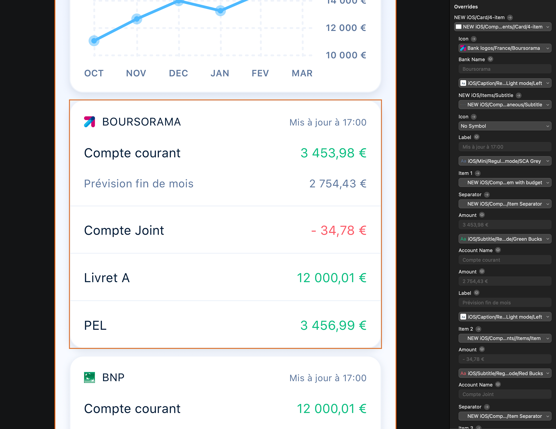
Furthermore, every time I detach a high-level symbol, I get a group with more low-level symbols to work with, which prevents any unwanted changes for the developers afterwards.
In the near future, and to make the design system even more useful, we should synchronise our development components with our design components, so every screen take less time to develop. But that dream probably won’t see the day anytime soon, considering the long list of tasks we have for our tech team.