Let’s be honest here, most old bank apps aren’t up to the standards we have today. With this personal project, I hope to bring this bank app to an acceptable level of usability, and if possible to make it pleasing to the eye.
Let’s start with the Logo. I used more definitive colors instead of the gradient and dark blue. It feels far better on a screen, and the contrast is satisfying. I also removed the few rounded corners of the icon and changed the dimensions to fit the logo type.
![]()
As for the font itself, the original logo seemed to use a variation of Prompt. I used the original Prompt here, more classical and bolder but it gives more impact overall. I’ll use Roboto as a secondary text font, as it goes well with this one.
Blue is somewhat overused in companies brandings today, but that’s their original colour so I’ll stick with it.
Small in-line version, when needed for printed documents and such.
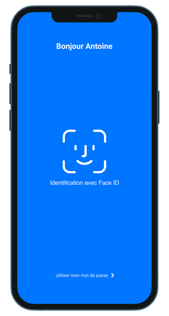
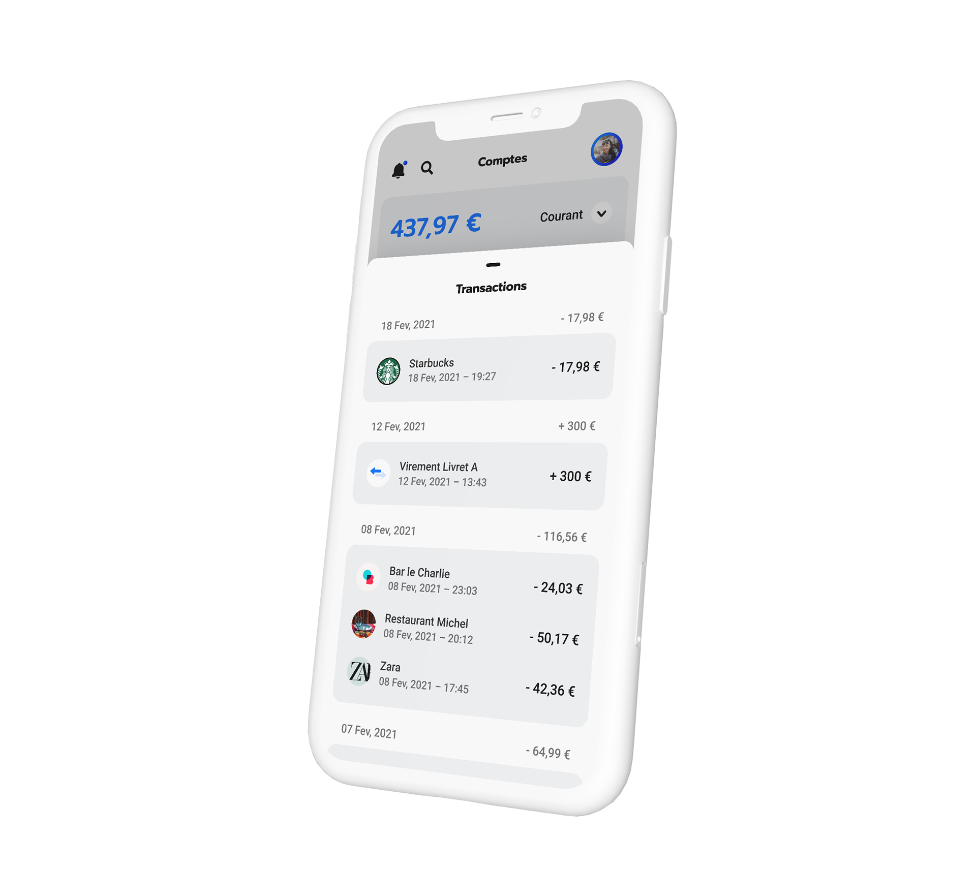
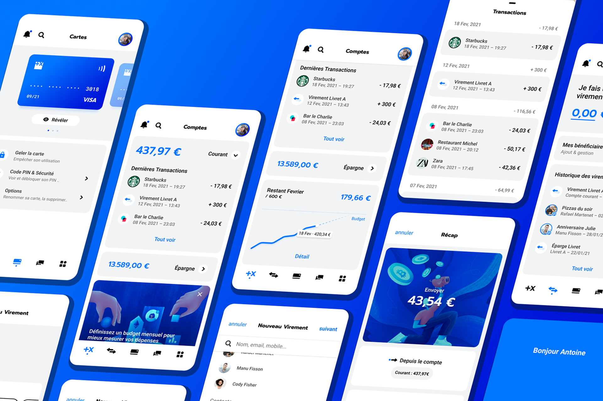
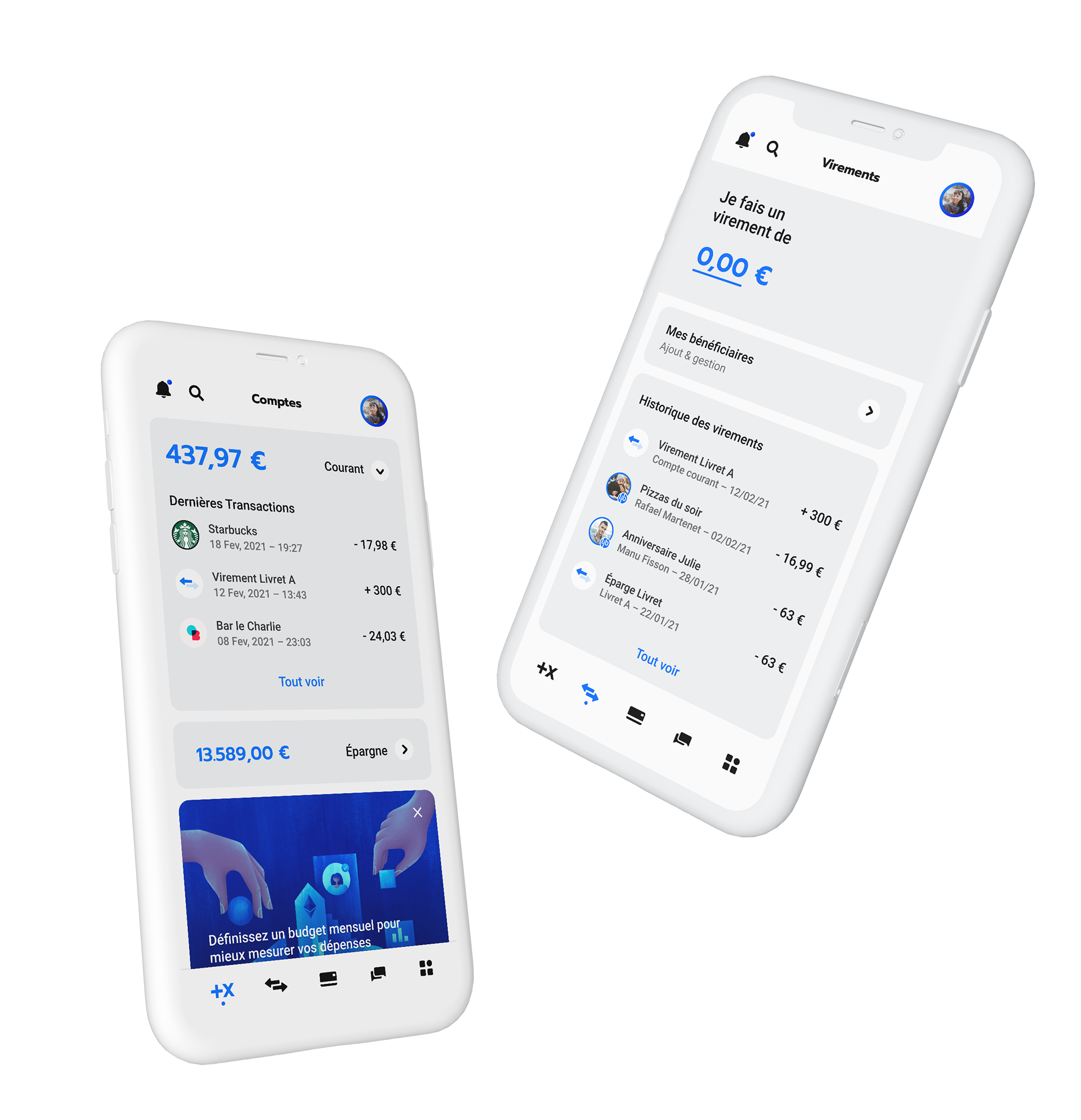
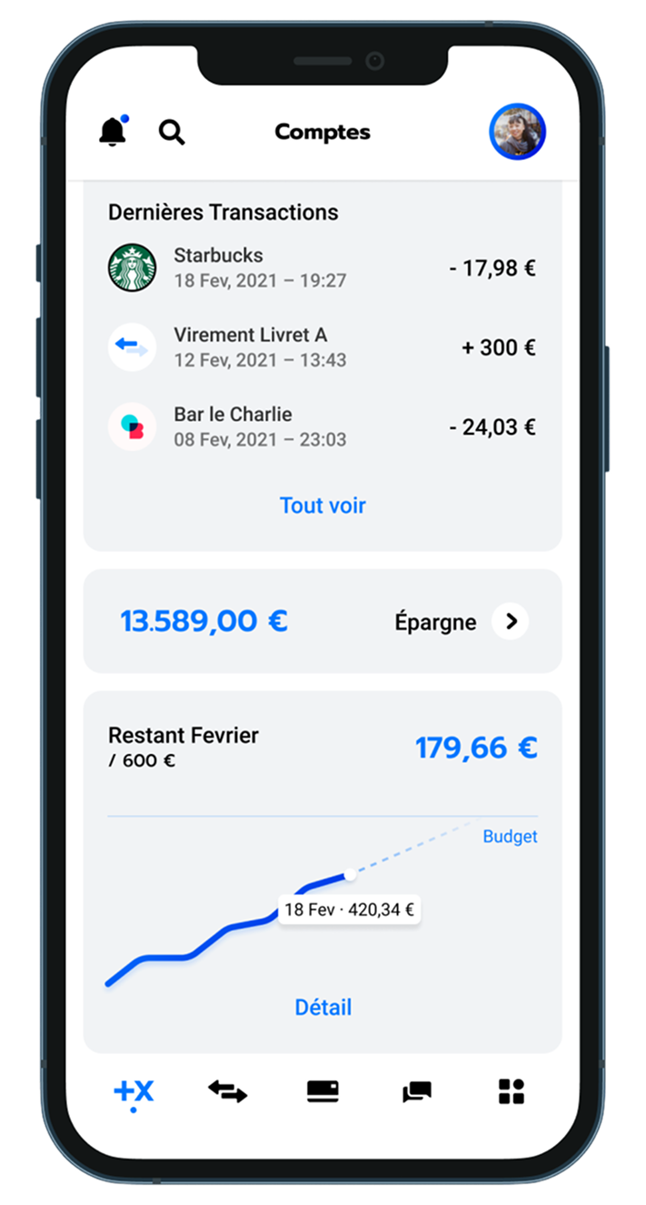
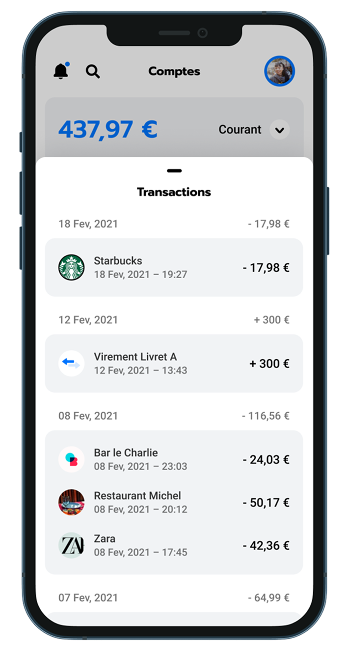
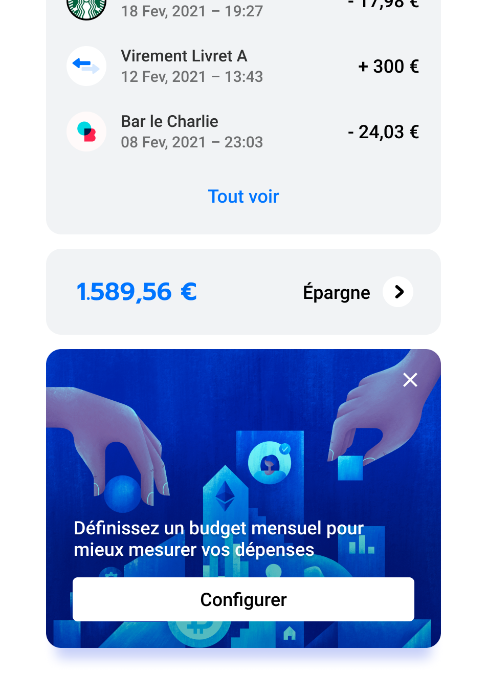
Once you’e authenticated, you land on the account page. Here you can see your accounts or savings, all your past transactions, and set a budget feature, to give you an overview of your month.
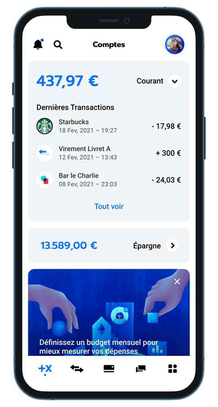
The illustration here is from Krestovskaya Anna, on Dribbble.
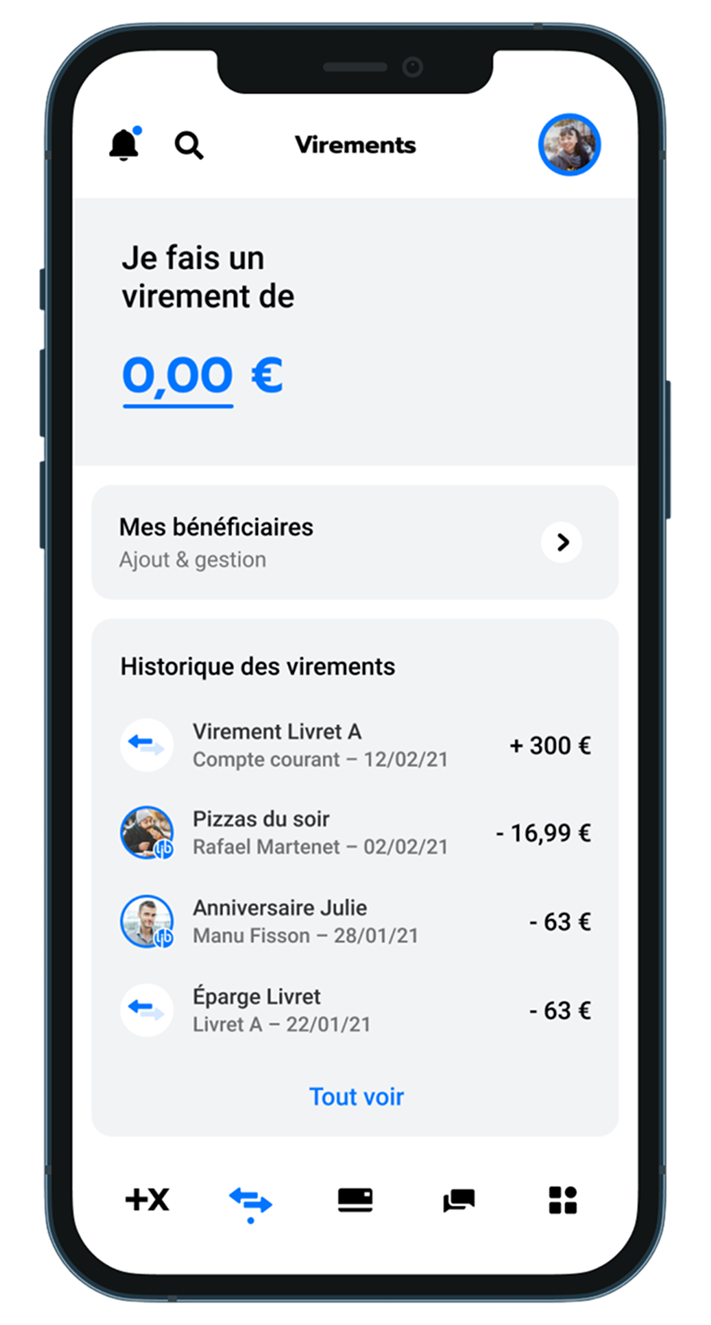
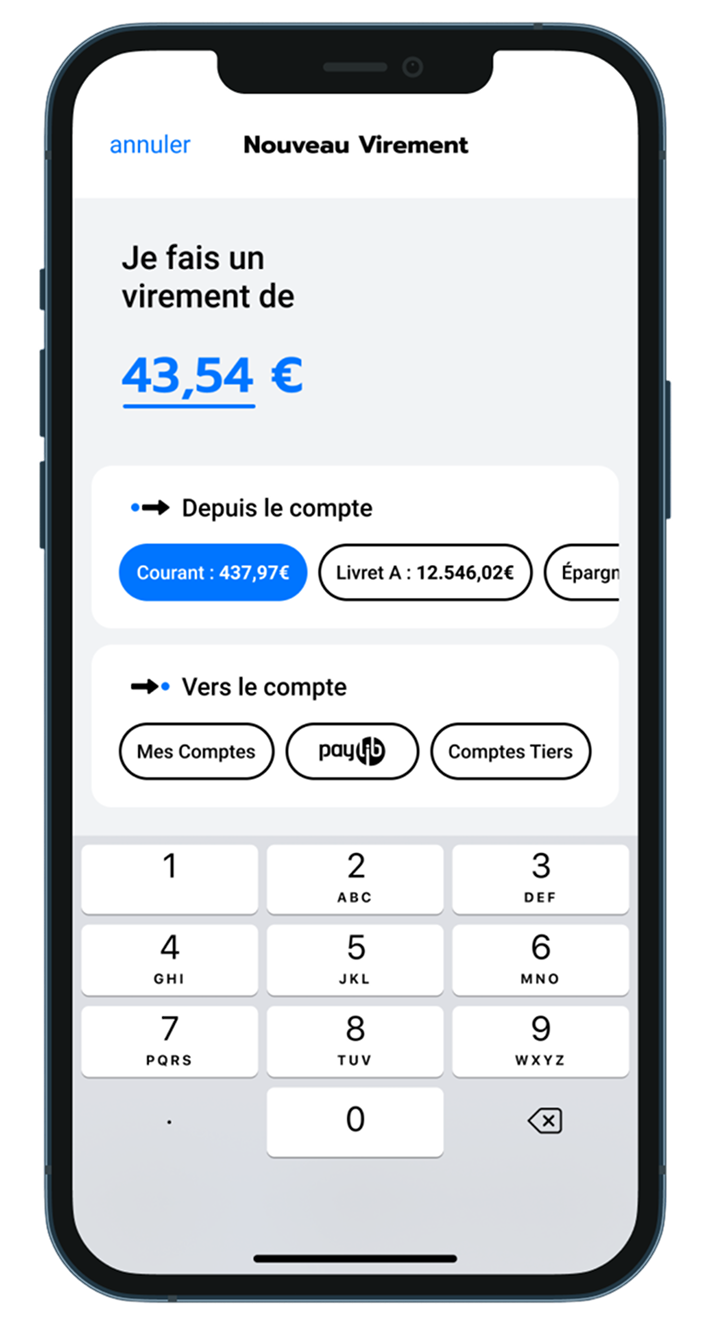
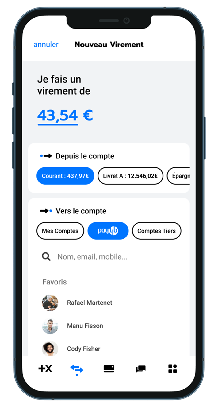
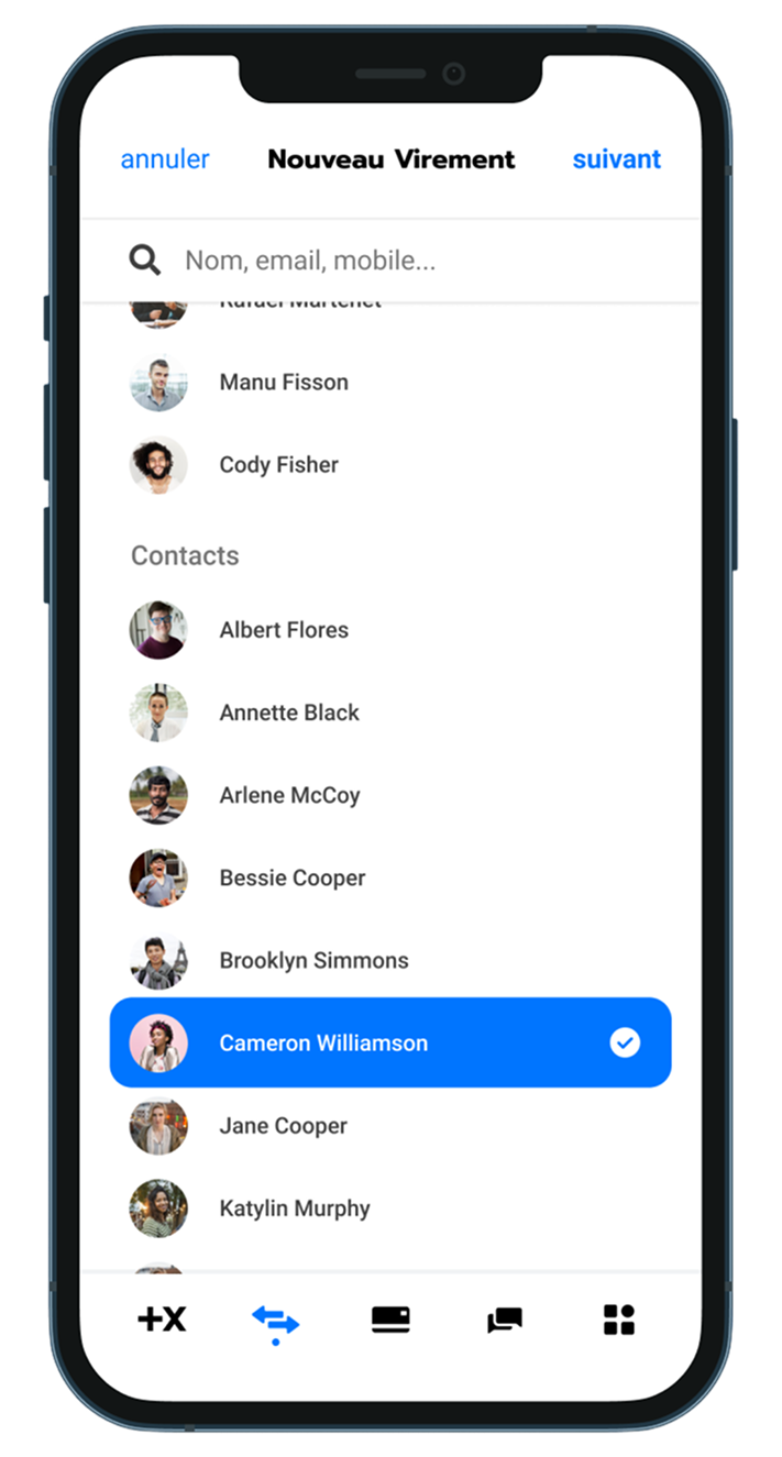
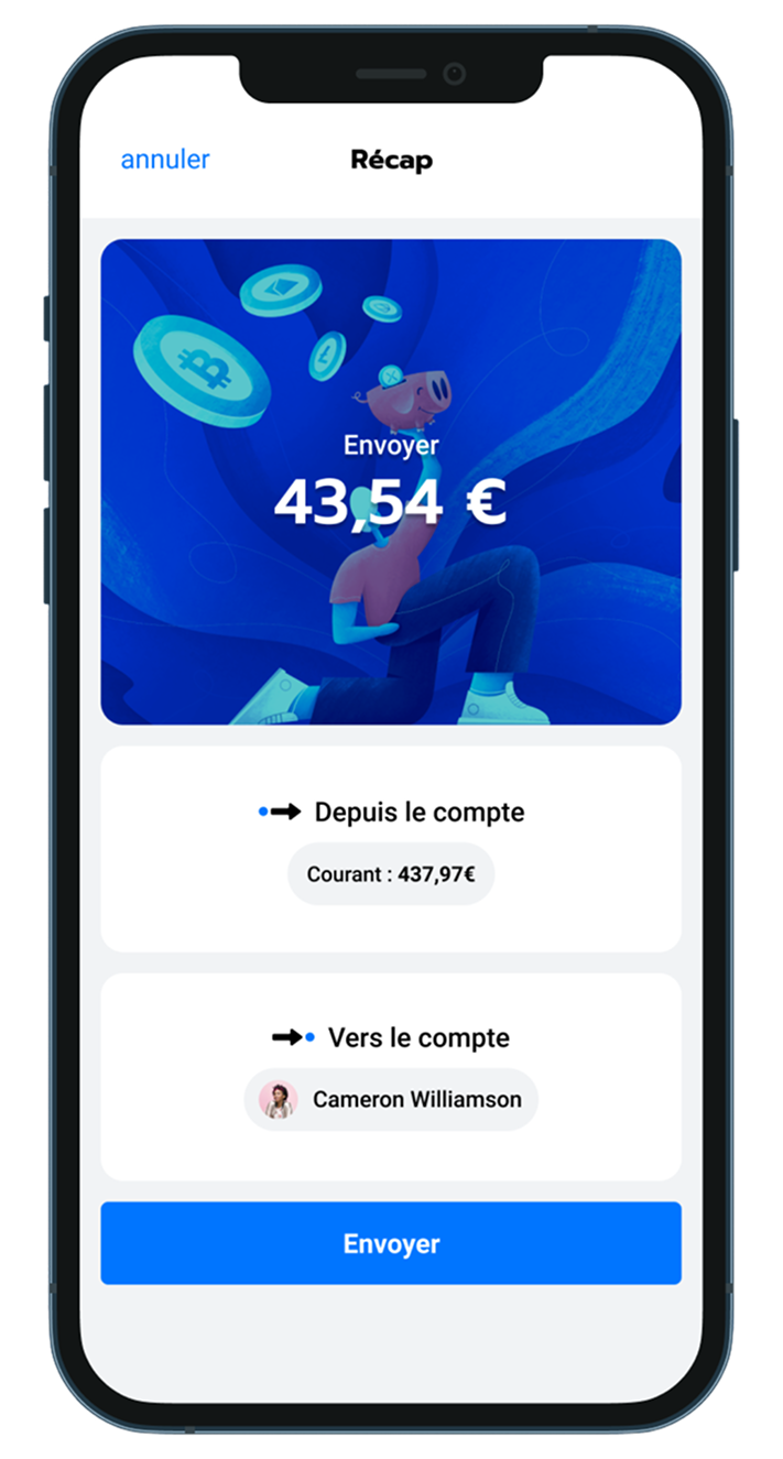
Below is the process to do a new money transfer. You type in the amount, then you choose the originating account, and then the receiving one. You can choose one of your accounts, an external account, or use PayLib to send money via a phone number or email.
In this tab, you handle your card security concerns, see your PIN or unlock it after 3 failed attempts, and a few other options. All sensitive actions are locked behind an authentification wall.
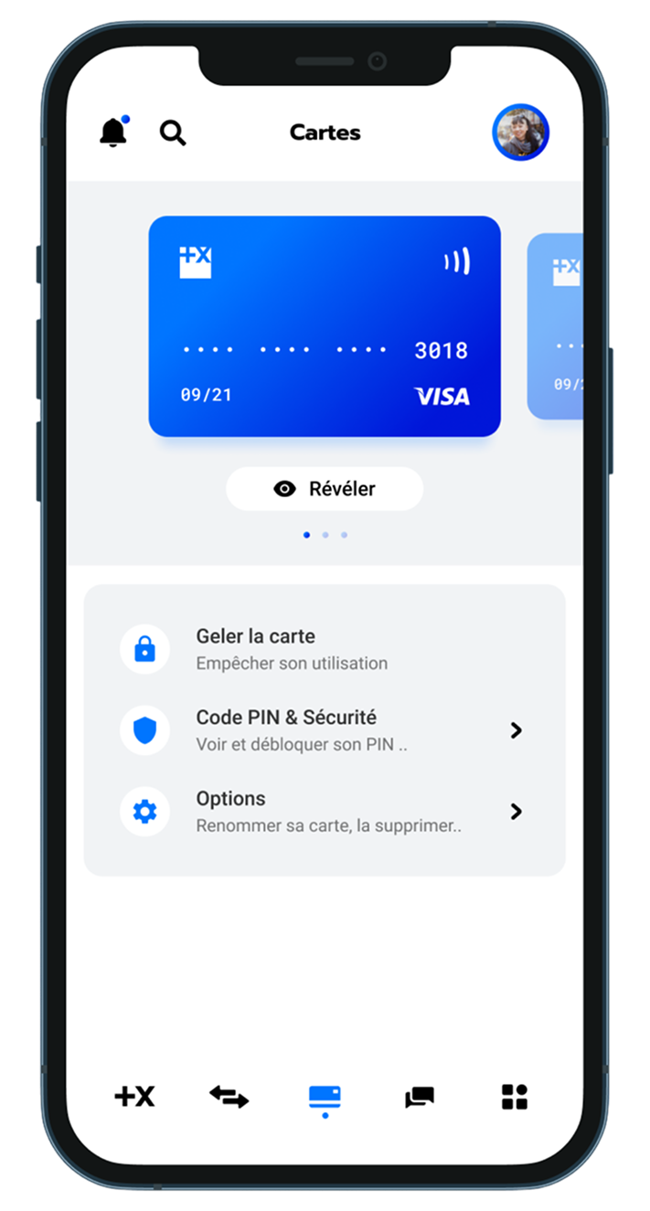
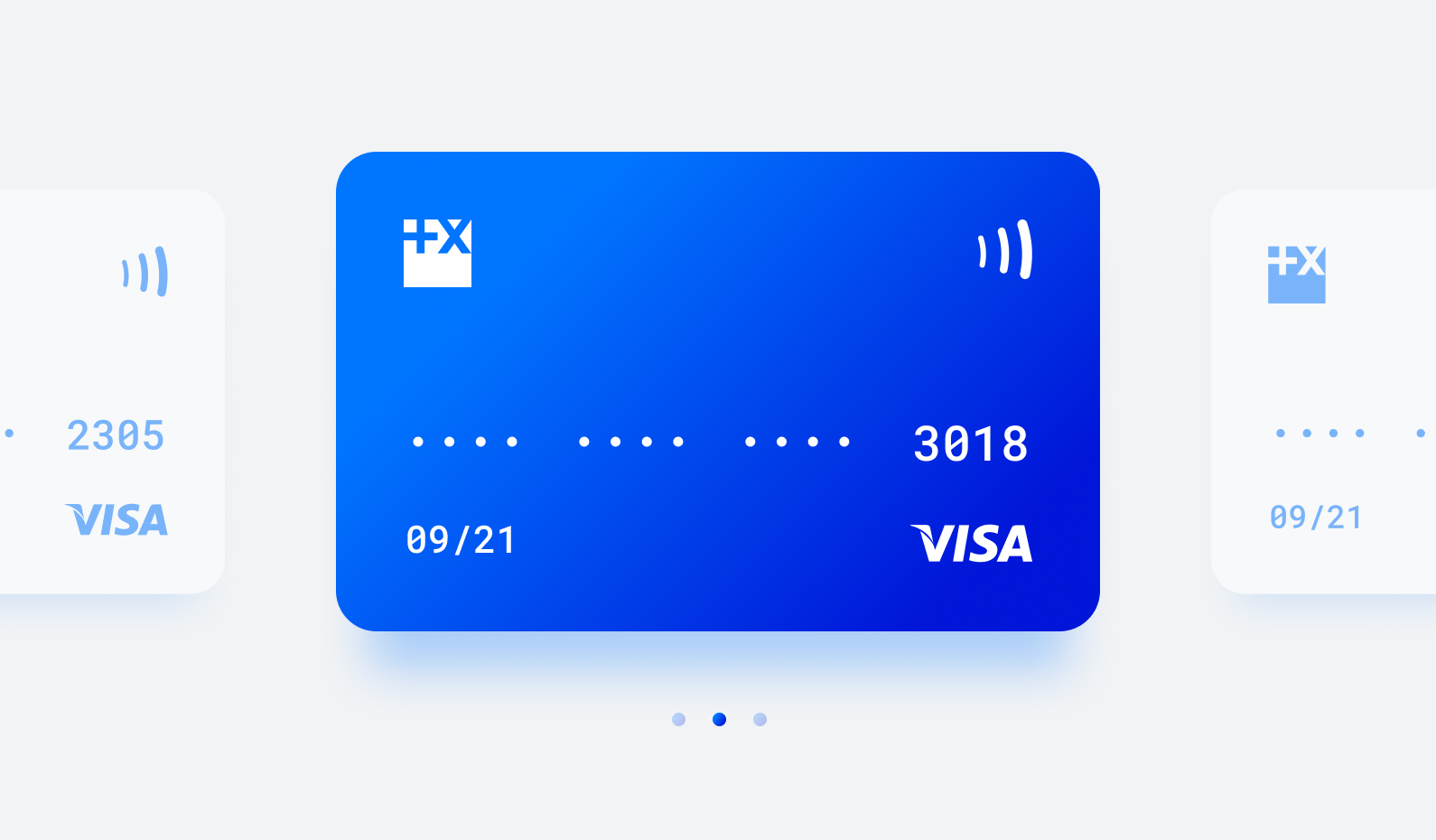
You can have both physical and virtual cards, and create or order more as needed.
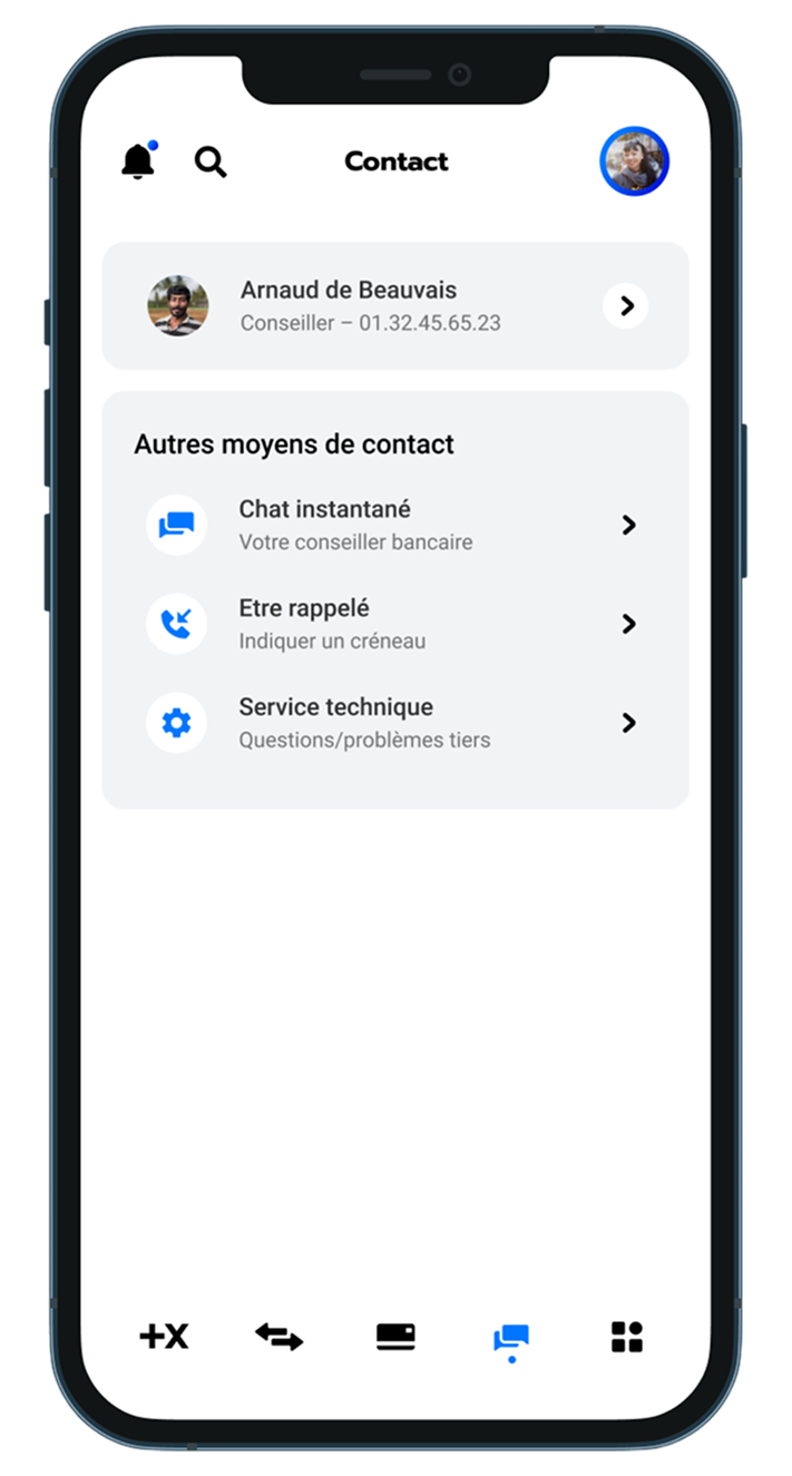
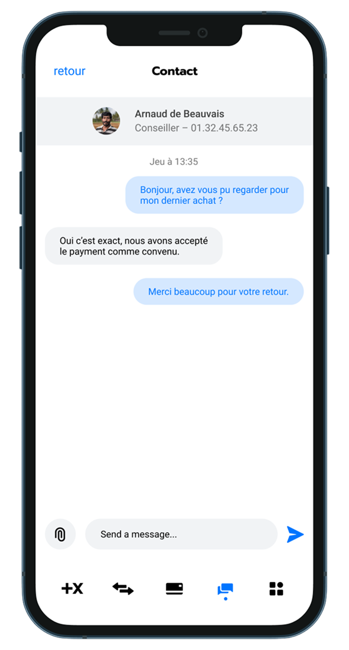
In the contact tab, you can chat freely with your account manager, as well as other options to contact your bank. Your current conversations are at the top.
The last tab, “services”, is here for secondary elements, like viewing contracts, insurances, documents, and such. I didn’t do the design since I’d need to list lots of products and it wouldn’t be that interesting.
Thank you for reading!