This is a quick spin-off of the Future of Coach mobile design project, made to showcase more “platform variety” in my designs.
No user tests or complex prototypes for presentation here, since I only made those designs in a couple of evenings. Please keep that in mind when reading through this article.
Future of Coach was designed as a mobile only experience, personal finance apps being a mobile only product as far as I know. Bringing that experience to the web was quite the challenge, and frankly I’m quite sure the work to develop it wouldn’t be worth the expense.
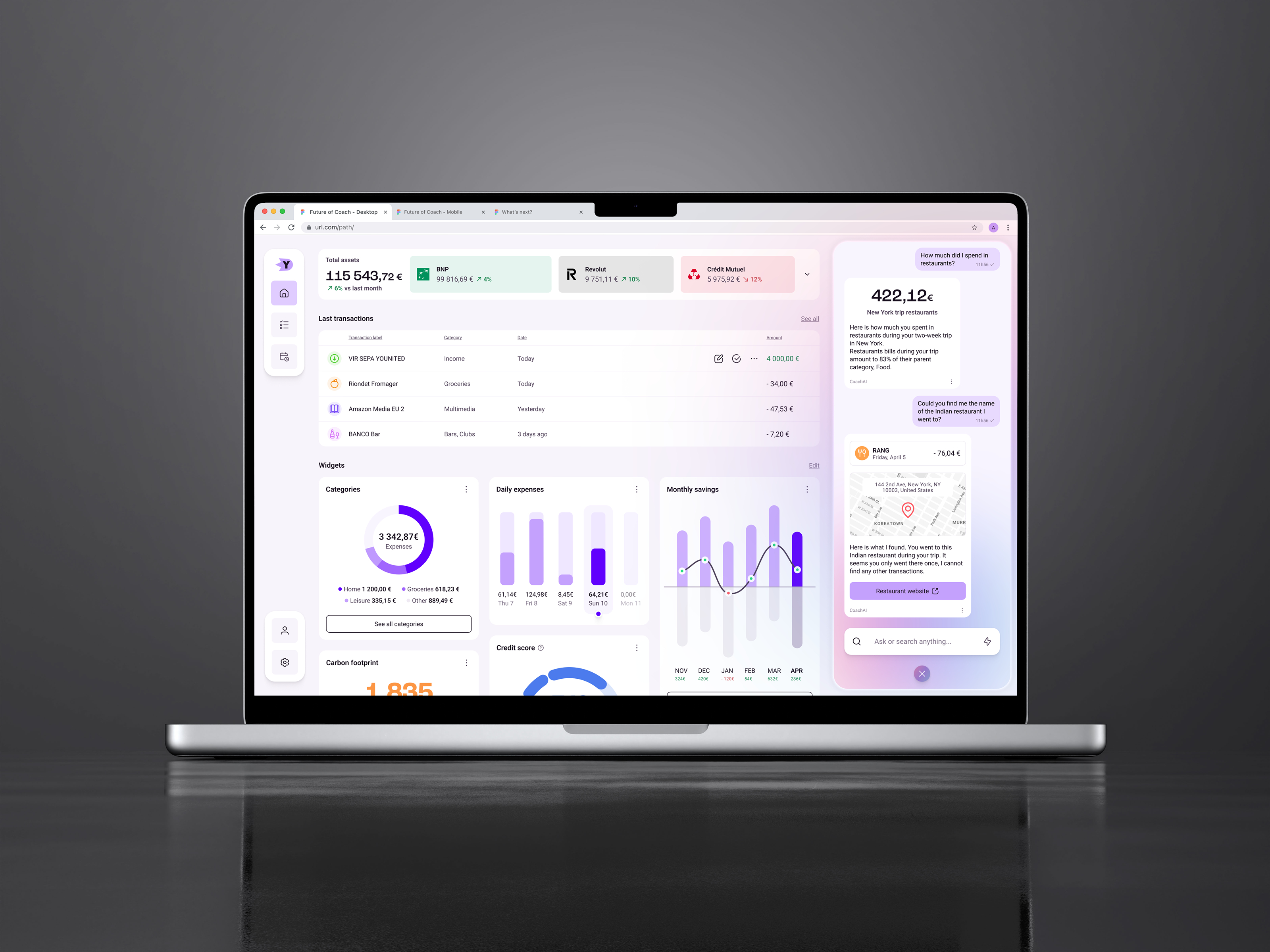
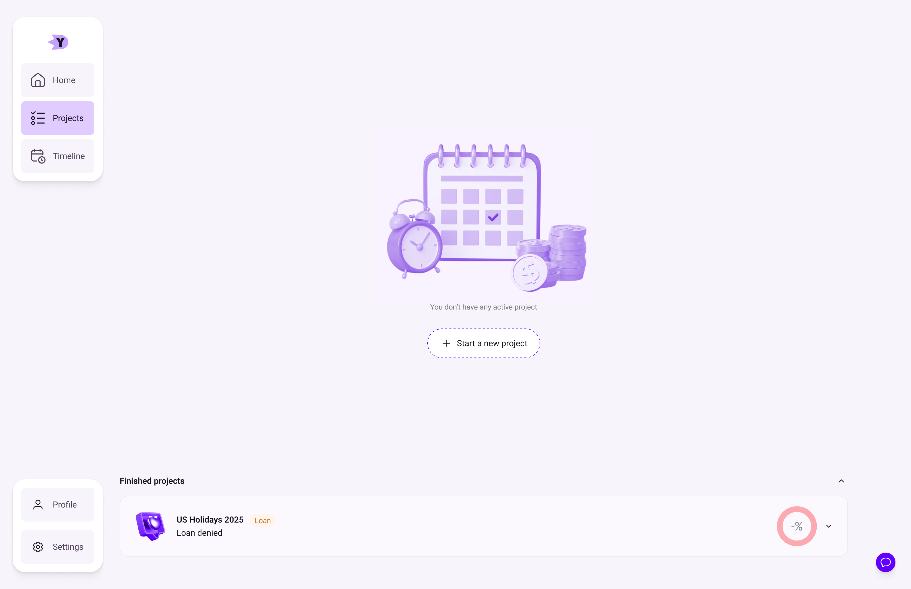
The first thing I did was the home page, being at the center of the app experience. Here you can find all the main features from the app, with a lot more real estate dedicated to the most important things for the user, meaning accounts and transactions.
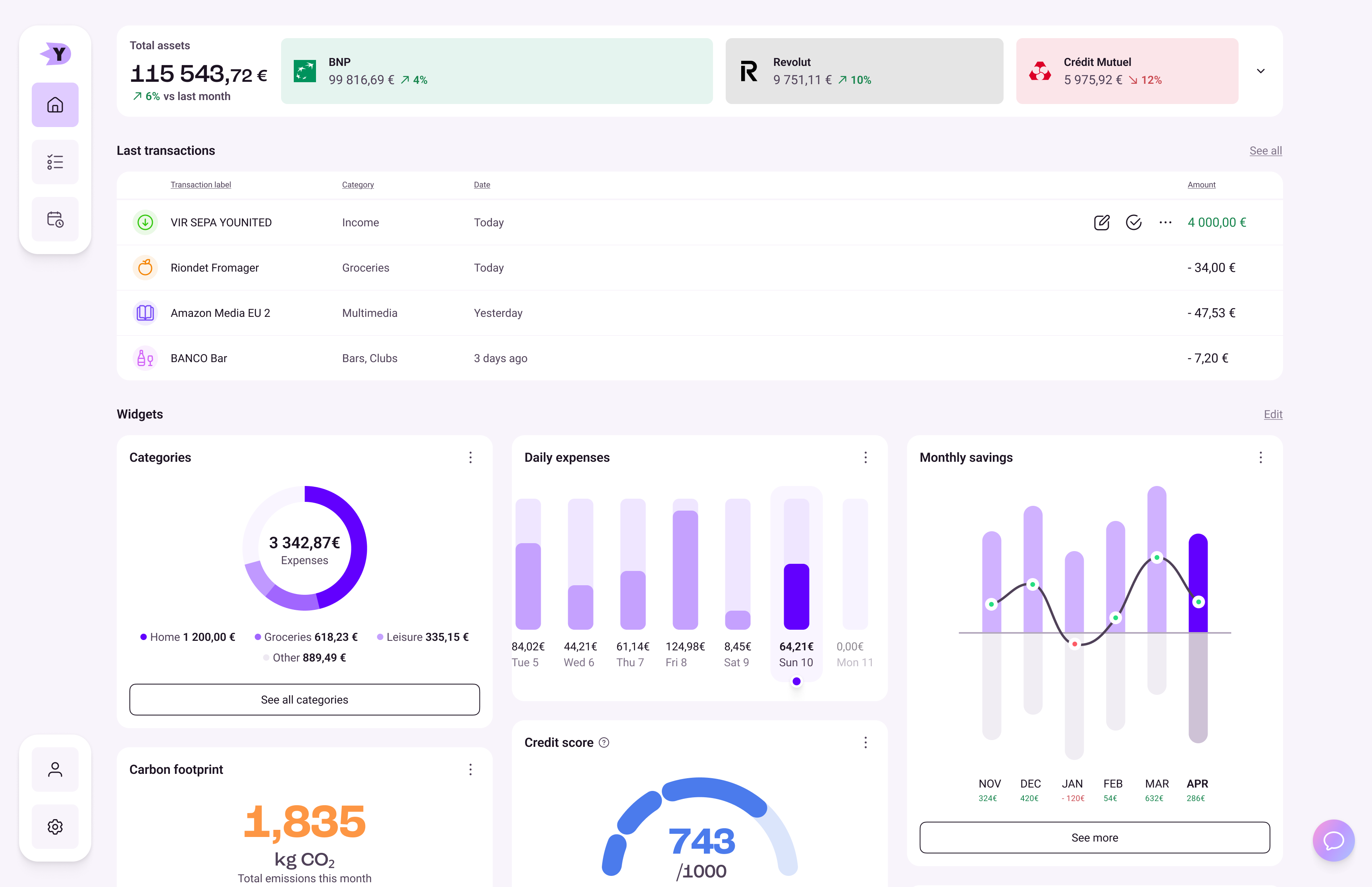
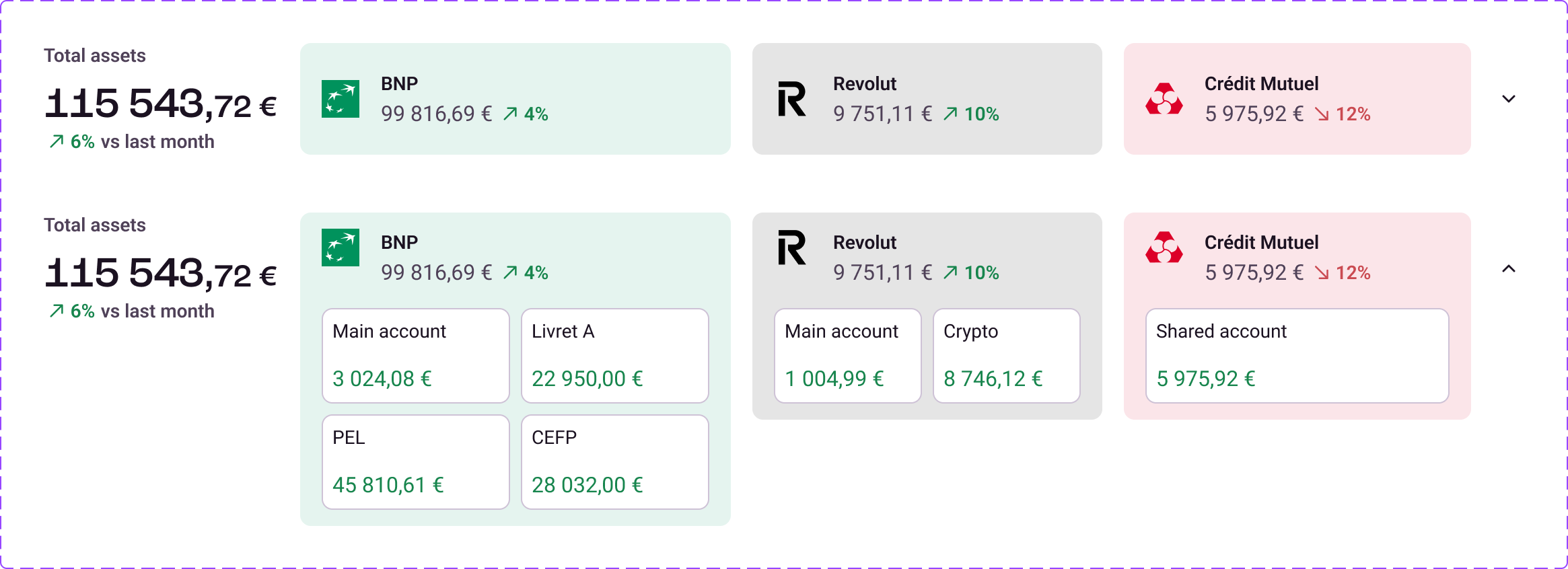
Below, widgets are stacked Pinterest-style. As with the mobile app, you can edit the order, add or delete widgets to make the home page yours. The accounts are shown closed here, but you can open them to see the details, and the app will remember your choice.
The interesting feature in this case is the chat button, bottom right, which will give access to CoachAI. I know that the position isn’t the best since users are used to having the support chat here on most web apps, but in my case it opens a panel that will stay here until closed. So I think it can work, I would have to test though.
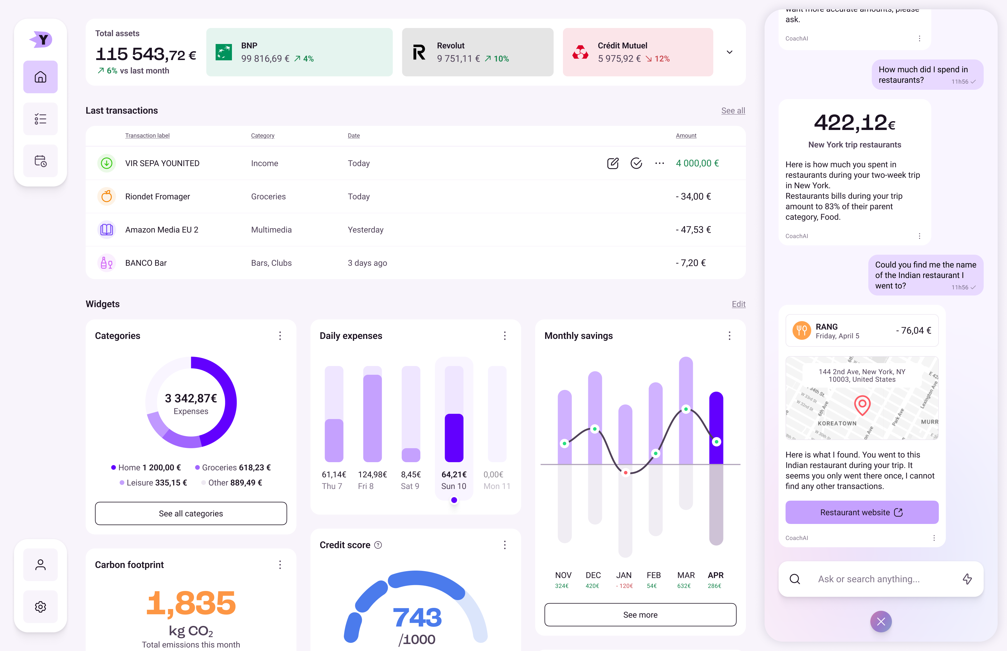
The whole opening and closing is accentuated by simple animations and a pulsating gradient a bit like Apple Intelligence. Although, because of time and tool constraints, it’s not going to be as impressive, just yet. You can have a look at the animation on the prototype below.
I recommend going fullscreen!
I have lots of ideas for power-user features, which would go very well with a desktop app. Multi-selection, quick account filtering, transaction check-off. Also, with all that space, interaction between the AI chat and content is much easier; I could add contextual buttons to quickly ask questions and such. I haven’t made any of these additions yet, but given the time, there are a few paths I could take to improve the design.
I also made desktop designs for the Project page. And you can see the opened version of the navigation menu!
At first, this is quite empty. I added a finished project, but a true new user will see barely anything. Adding a new project is quite simple, however, as we saw in the mobile design. Using the chat or the new project button, and here we go.
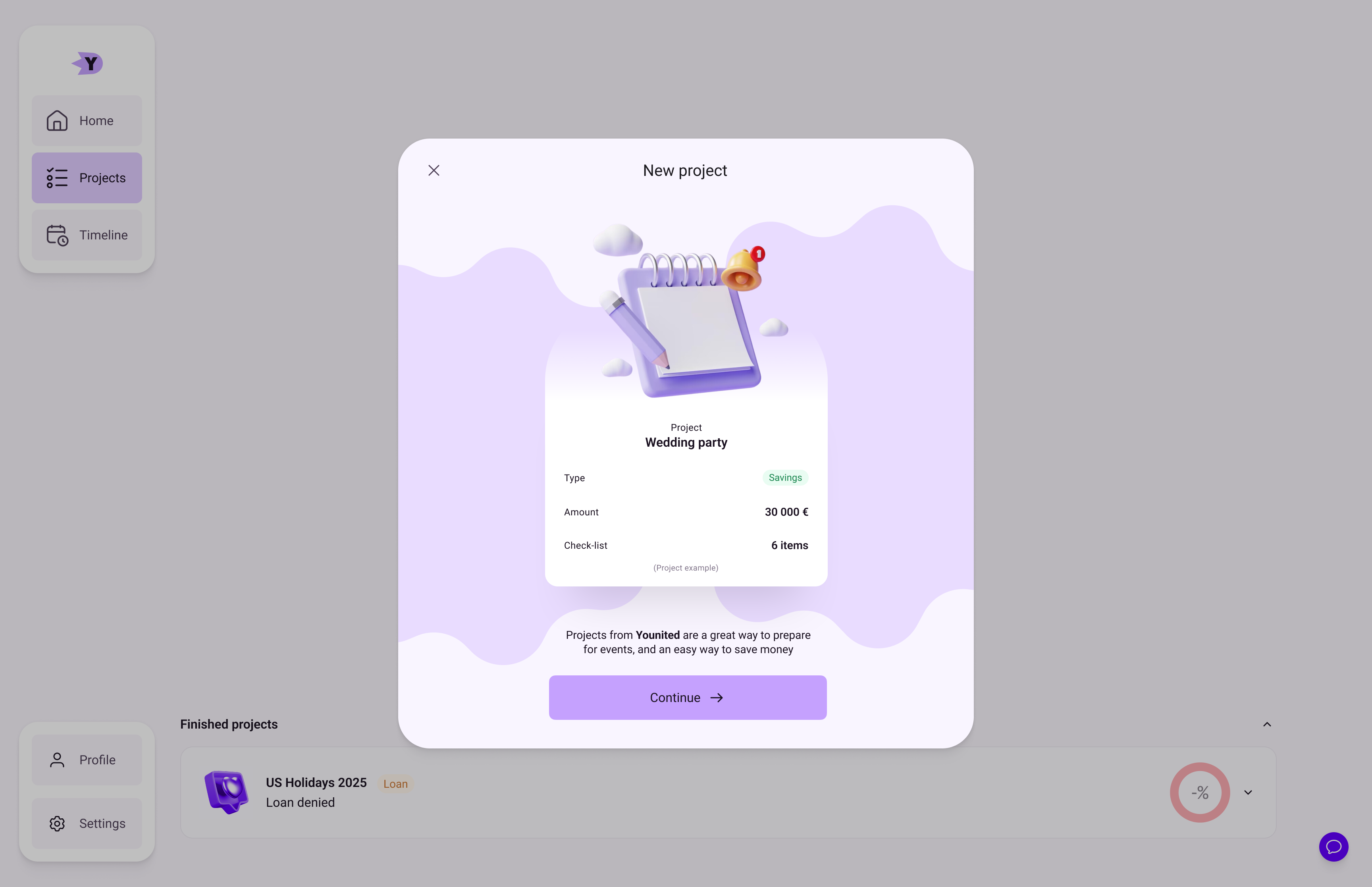
I think that using pop-ups in a desktop app is lazy most of the time, except for important alerts. Given the time, I would probably change that and use the main page. Creating a project is one of the main features of this app, it deserves space and context.
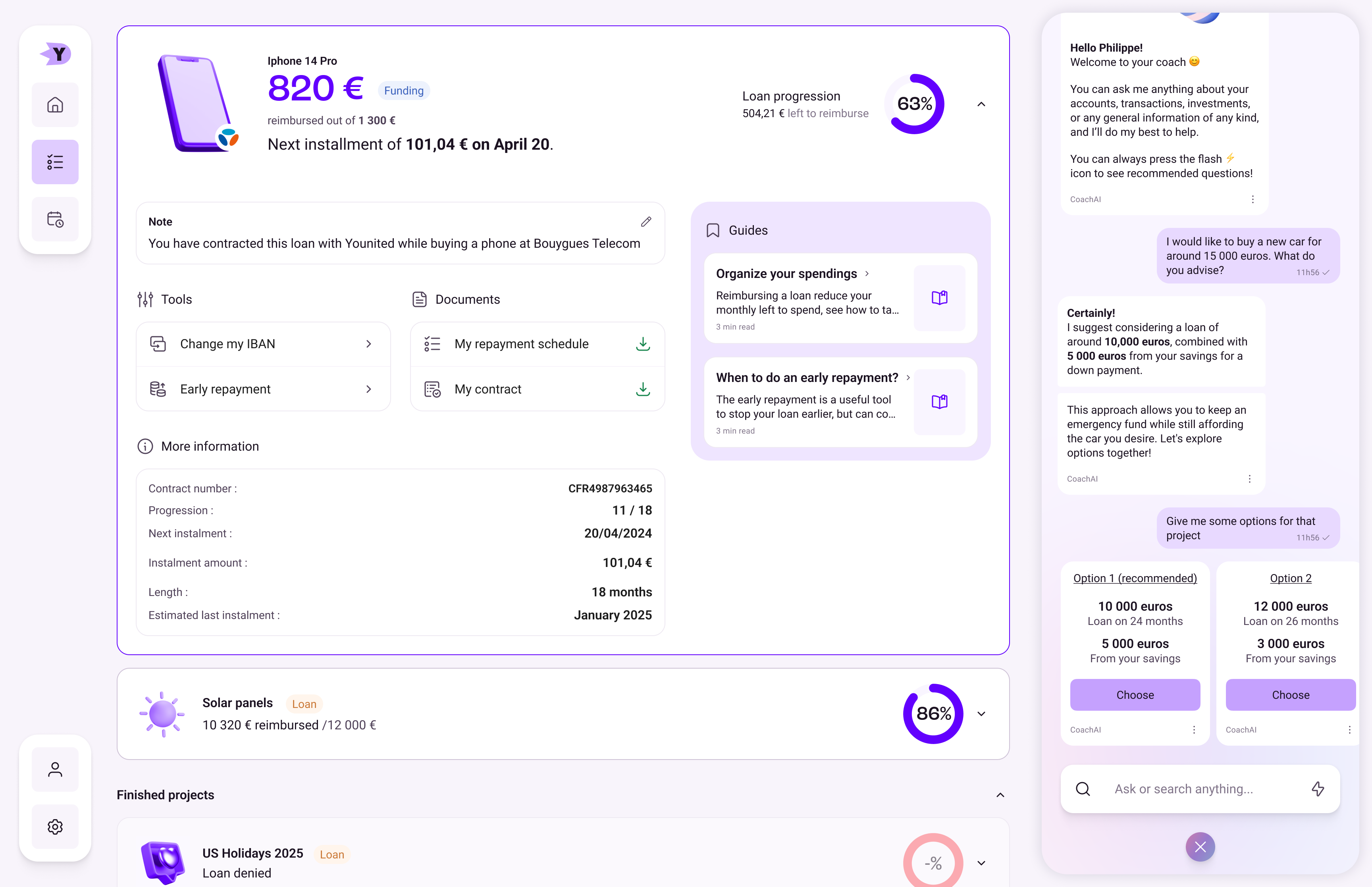
Here you can see the same page, but filled with projects and with the chat opened. It’s quite dense now, but you could always close the chat to gain some space. Anyway, here you can see an opened project, with all the information, actions and documents available in a typical credit at Younited. Loan progression is clearly visible, and there’s even some guides to help you organize your finances! Only one project can be opened at the same time.
This covers everything I made in the couple of evenings I had to produce this desktop version. It’s obviously incomplete, and looks more like a Dribbble shot than an actual product, but I think it showcases to an extent my ability to design for a different format, like a desktop.
It’s much older, but I also worked on a desktop-first environment at Mention. I don’t have much to show but the two designs I kept are here.
Thank you for reading!