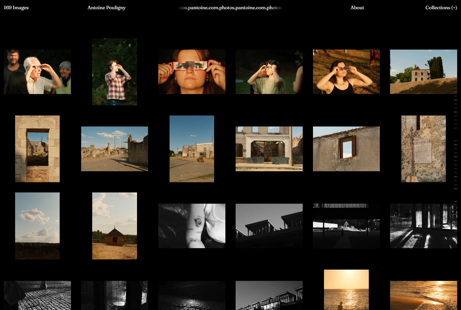
photos.pantoine.com is where I keep my photos, organized into collections going back to 2020.
The first version I built was a slow, one-photo-at-a-time gallery. It worked fine when I only had a couple dozen pictures up, but it quickly became frustrating to browse as the archive grew. So I rebuilt it from scratch around a simpler idea: let people see the whole archive at a glance, and then dive into individual photos or series properly.
The home page is a dense index showing every photo as a small thumbnail on a dark background. Hovering a thumbnail shows which collection it belongs to in the top corner. I also hid a small easter egg in the header: if you drag the scrolling marquee left or right, it changes the number of columns in the grid so you can either zoom out to see everything at once or make the thumbnails larger.
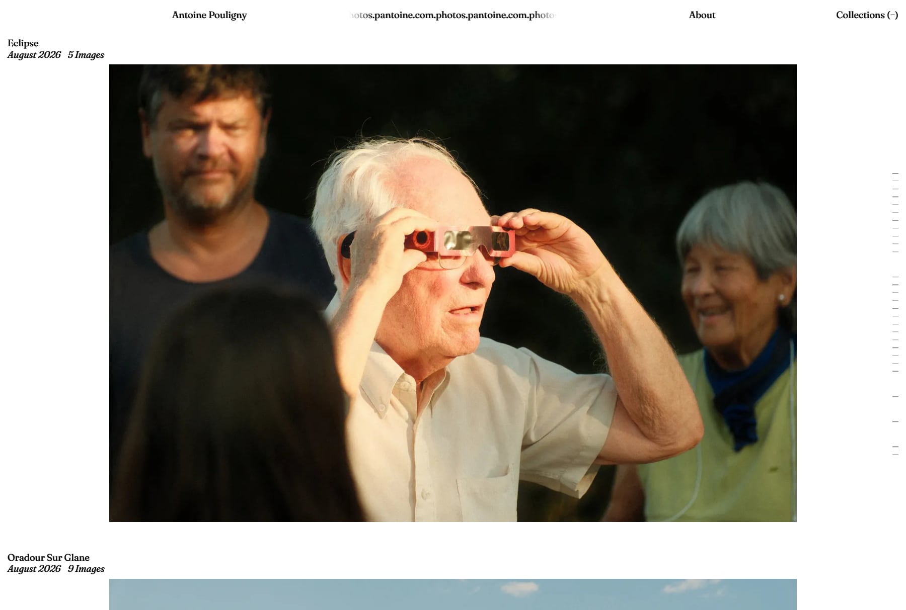
Pressing I (or clicking Collections) flips the site to a white page with one large cover photo per series. On the right edge, there’s a quiet timeline made of small horizontal ticks grouped by year. When you hover over it, it expands to show the collection names so you can jump straight to any trip or series.
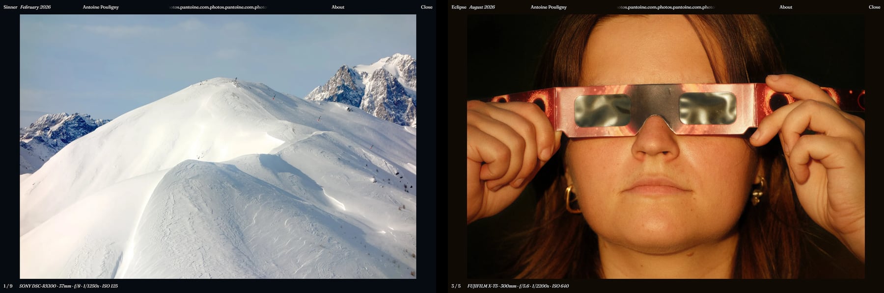
I spent most of my time on how the photo viewer feels. When you click a thumbnail, the image smoothly animates from its spot in the grid to the center of the screen, and flies right back into place when you close it, scrolling the page automatically if you moved far away in the meantime.
Once a photo is open, clicking the left or right half moves through the series, with camera and lens details shown subtly at the bottom. On mobile, you can swipe between photos or flick an image up or down to send it back to the grid. Each photo also gets its own URL hash so sharing a link or hitting the browser’s back button always lands on the exact right image.
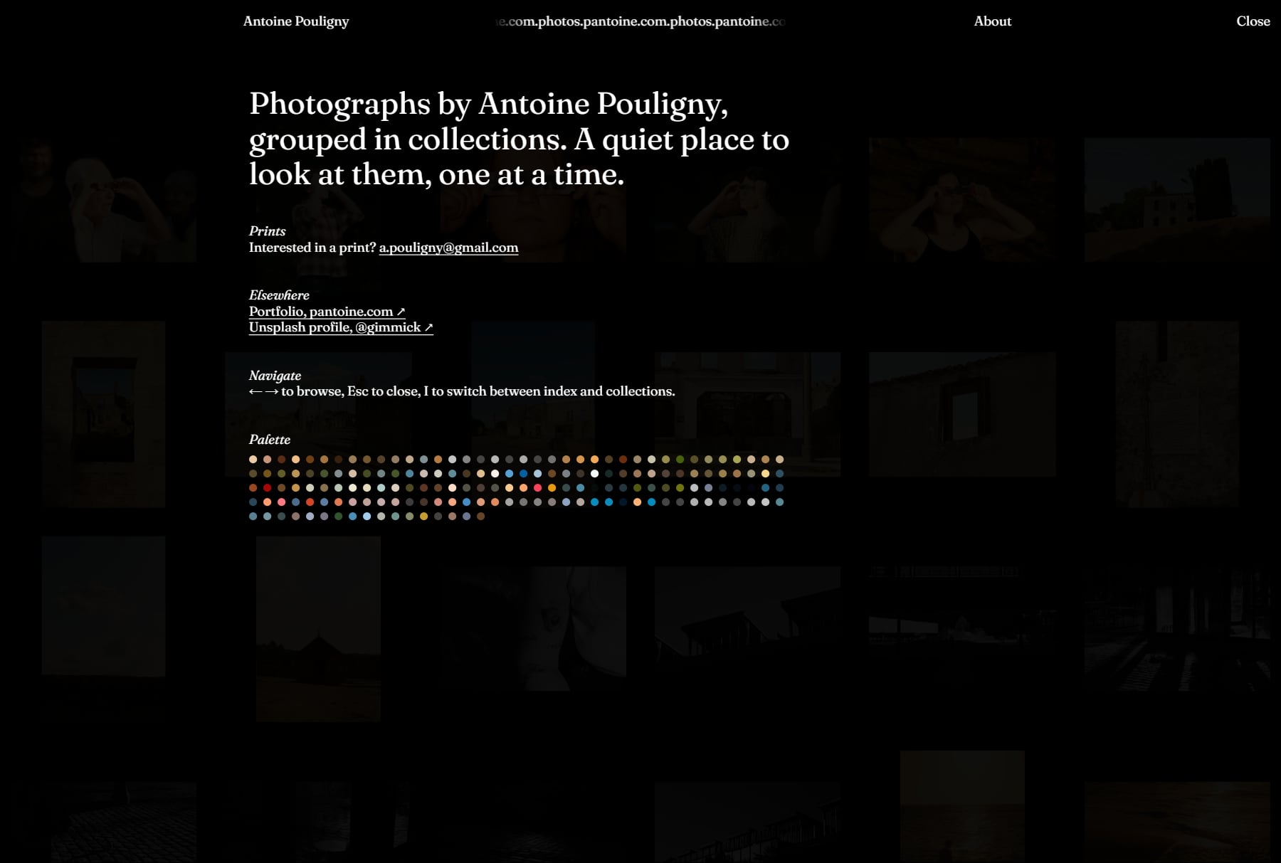
At build time, a script extracts the dominant color of every photo. Instead of tinting the whole page aggressively like I did in v1, I used those colors for smaller touches: blurred loading placeholders, a subtle 8% tint on the dark viewer background that shifts smoothly as you browse from one series to the next, and a grid of colored dots in the About overlay where each dot links to its photo.
The site is built with Astro, TypeScript, and plain CSS. To make it easy to maintain, I wrote a small local script so adding new photos takes a single command: I just drop my exports into a folder, and it generates the optimized WebP files, extracts the EXIF camera settings, and strips out GPS metadata before anything goes online.
Side projects from the same period
Around the same time I started the first version of the photo site, I also put together two smaller sites. They still work, though I haven’t updated them as much lately.
Pixel Looks (pixelooks.pantoine.com)
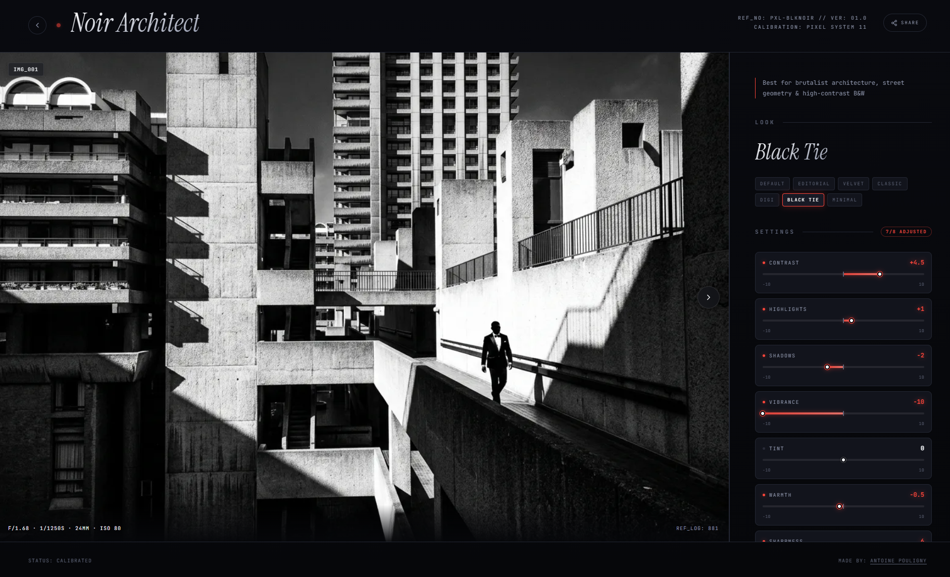
A small archive of camera “looks” and color grading settings for the Pixel, shown with sample photos and their EXIF data. Anyone can submit a new look without making an account, and it automatically opens a pull request on my GitHub repo for me to review.
Antoine’s Kitchen (recipes.pantoine.com)
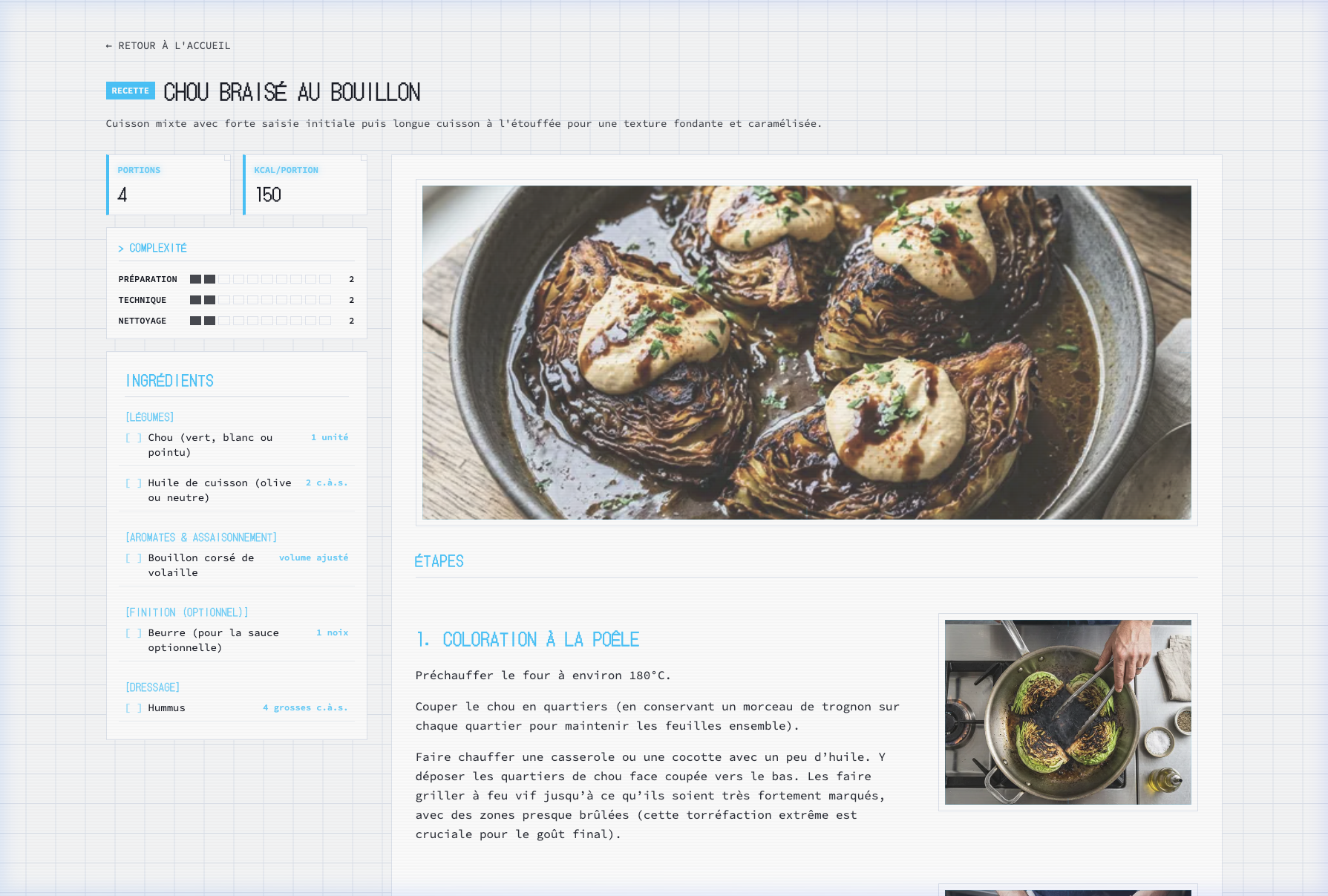
A place to keep my own cooking recipes, along with the little personal notes and adjustments that usually stay scribbled in a notebook. It has simple category filters and built-in timers you can click right inside the steps while cooking.